Updates

Fiuit updates

What’s new in Fiuit for your business, update by update.

Subscribe to the feed (Atom)

Week of November 16

· 1 change

Update of November 22, 2026

New

Kiosk: customers order on their own from a tablet in your store

Put a tablet on the counter: customers browse your products by category, build their order and pay right there with QR or card, or at the counter with their order number.

What you get

  • Shorter lines at the counter: customers build their order while you serve someone else.
  • Like an online store: categories with photos, options (size, flavor, fit) and the cart always in view.
  • Nothing to set up: it uses the products and categories you already have; anything not offered to customers stays hidden.
  • Safe: the tablet only sees the published catalog and creates orders; it can't see customers or money.
Permalink
· 2 changes

Update of November 21, 2026

New

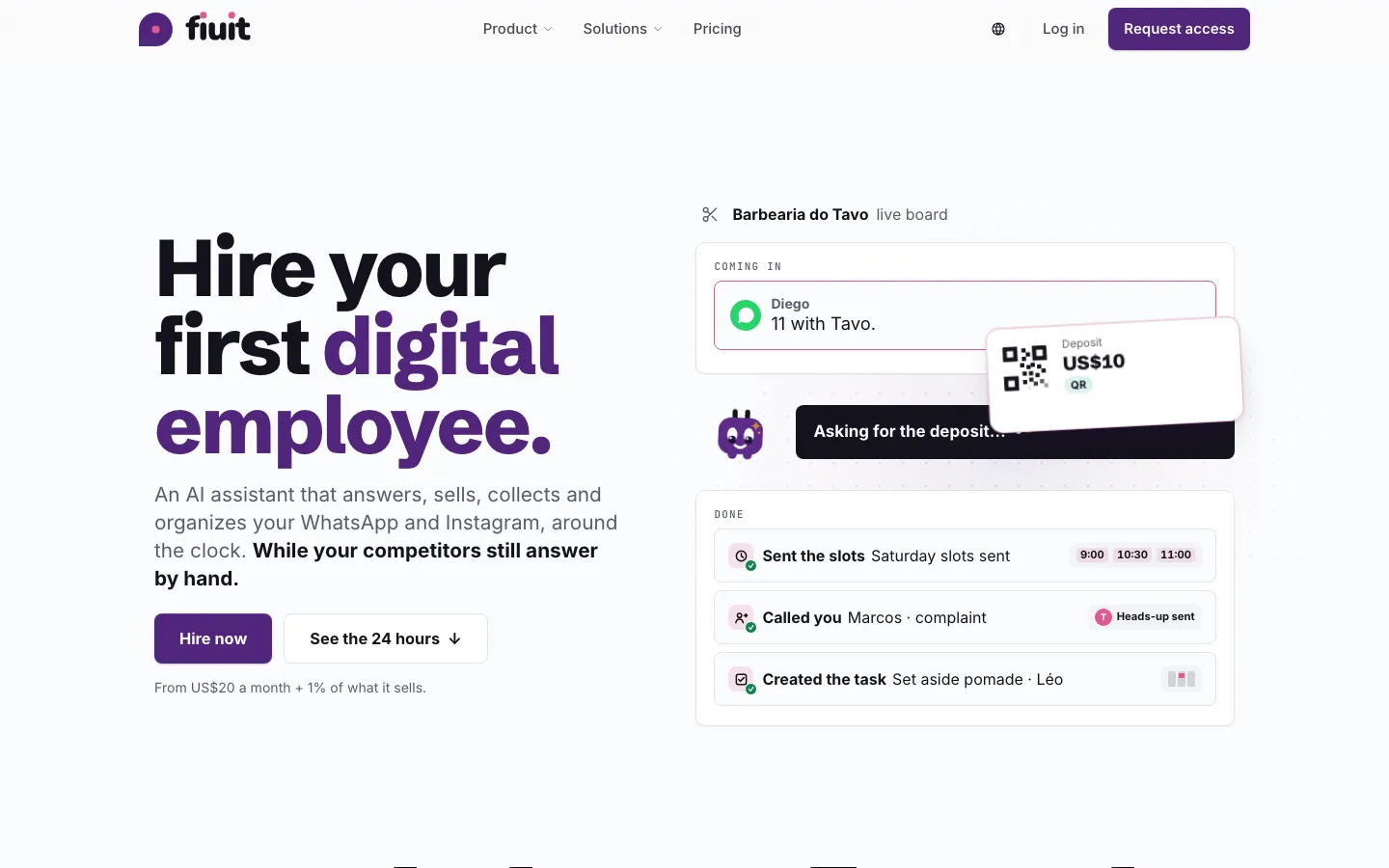
A new website: Fiuit told as a digital employee

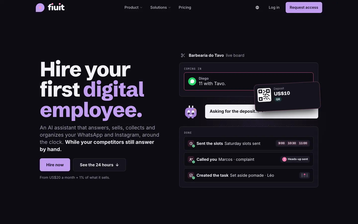
The home page shows Wagy working live, Product gets a tour and eight modules with real screens, and Solutions walks through how each type of business uses Fiuit.

Home page: “Hire your first digital employee” and the live panel, with Wagy sending the free slotsHome page: “Hire your first digital employee” and the live panel, with Wagy sending the free slots

What you get

  • See it before you sign up: the live panel shows Wagy answering, booking and charging, with what gets recorded in the system.
  • The product, really explained: each module with real screens, concrete examples and the exact link to the docs.
  • Your type of business: health, barbershops, shops, logistics, workshops and courts, each with its step-by-step journey.
  • Only what exists: what is still on the way shows as “Coming soon”.
Permalink
Improvement

Service and product, each with its own name

In businesses that sell products, «Service» is no longer renamed «Product»: in «+ Item» you see «Product» once, and «Service» only if you have services set up.

What you get

  • No duplicates: «+ Item» shows «Product» once, with «Discount» separate.
  • Less noise: with no services, it doesn't offer «+ Service».
  • Nothing to configure: old saved names fix themselves.
Permalink
· 13 changes

Update of November 19, 2026

Improvement

Search when selling and editable quantity

When selling products you type or scan and filter by category; each line's quantity can be typed.

What you get

  • Clean screen: no long lists to scroll.
  • Fast quantities: type 12 instead of tapping 12 times.
  • One place to sell: «New order» with products opens «Sell», which asks how it is delivered (default: takes it now) and when they pay (default: now).
Permalink
New

Adjust stock by writing it the way you'd say it

Write «10 pairs of size 42 came in» on the product page and Fiuit builds the stock adjustment per size or color. You review it before confirming.

What you get

  • The way you say it: «came in», «went out» or «there are», with the quantity and size or color, without going option by option.
  • No surprises: you see what each option goes from and to before confirming; anything doubtful is not applied.
Permalink
New

New task written in your own words

When creating a task or appointment, write «tomorrow 3 pm haircut for John with Sebastian» and Wagy fills in customer, service, person and time, checking that the time is free. The task is created when you confirm it.

What you get

  • Faster: one sentence instead of three steps.
  • With the real schedule: if the time is taken, you see the nearest free ones.
  • No surprises: nothing is created and the customer isn't notified until you tap «Create». Without AI, dates, times and names are still read by rules.
Permalink
Improvement

Sales are a flow: Order, Payment, Delivery and Done

Every product sale follows the same stages and moves on its own: once paid it goes to Delivery, and if the customer takes it and pays on the spot it is done.

What you get

  • One way to sell: counter, bot and panel leave the sale in the same stage.
  • Nothing marked by hand: it moves to Delivery only when the payment is recorded.
  • Customer notices: «shipped» or «ready for pickup», with the usual stage notice.
Permalink
New

Team: invite by typing

In «Invite to the team» you type «add Sebastian, barber, WhatsApp…» and Wagy fills in who, which role and how. The invitation is only sent when you tap «Invite».

What you get

  • Faster: one line instead of each field.
  • No surprises: an invitation is a message to someone else: you see who, which role and which number, and nothing is sent until «Invite».
  • Only what you can give: Wagy never proposes a role above yours; the job («barber») is shown but grants no permissions.
  • Without AI, too: if the AI doesn't respond, the WhatsApp, email and role are still read and you fill in the rest by hand.
Permalink
New

Hours and closed days written in your own words

In a person's or resource's schedule, write «Mon-Fri 9-18, Sat until 13; the 25th closed» and Wagy builds the week and the closed days. You see what it replaces and the already-booked tasks that would fall outside before confirming.

What you get

  • Faster: one sentence instead of editing day by day.
  • No overwriting booked tasks silently: replacing the schedule shows what changes, and already-booked tasks that would fall outside are left untouched and flagged.
  • No surprises: nothing is saved until you confirm. Without AI, days and hours are still read by rules.
Permalink
New

Delivery cost: set it by typing

In Zones, «Delivery cost» shows each zone with its cost and free delivery over an amount. You write how you charge for delivery («free delivery in Downtown, $10 up to 5 km; free over $200») and review zone by zone before saving.

What you get

  • Faster: one sentence instead of setting zone by zone.
  • No money surprises: you see each zone with the cost it will have; nothing is saved until «Confirm» and you can undo it.
  • Nothing made up: it uses your zones. A neighborhood that is not a zone, «further away» or a minimum order show in yellow and are not saved.
  • Without AI too: «Edit manually» has a field per zone and the «free from», with the same review before saving.
  • For new orders: the delivery of an order already placed does not change.
Permalink
Improvement

Your bot sells with the «Sale» flow

What the bot sells goes into the same «Sale» flow as the counter: it asks whether it is delivery or pickup, asks for the address only when needed and leaves the order in Payment.

What you get

  • One way to sell: the bot, the counter and the API use the same flow.
  • No extra questions: the address is asked only for delivery.
  • The usual notices: each flow stage's messages («we got your payment», «your order is on its way»).
Permalink
Improvement

Your bot asks for details only when they are needed

The bot no longer opens with a questionnaire: it asks for each detail of the service form when closing the order, repeating at most once, and never asks what the customer already said.

What you get

  • No questionnaire up front: each detail is asked when it is needed.
  • No repeated questions: what the customer already said, in this chat or in earlier orders, is used right away.
  • No insisting: one question and, at most, one repeat per detail.
  • A person when needed: if a required detail is refused, your team picks up the chat with the summary.
Permalink
New

Bot: add what it knows by typing

In «What the bot knows» you type «we open on holidays by appointment; parking on the corner» and Wagy builds the questions and answers. They are only saved when you tap «Confirm».

What you get

  • Faster: one line instead of one entry at a time.
  • No surprises: this changes what the bot tells your customers: you see every answer and nothing is saved until «Confirm».
  • No duplicates: if you already added something similar, Wagy tells you and does not duplicate it.
  • Without AI, too: if the AI does not respond, the sentences stay as text and you add them by hand as always.
Permalink
New

Services: add them by typing

In «New service» you write in your own words («haircut 30 min $8,000 with optional wash») and Wagy fills in the form. You confirm the price before saving.

What you get

  • Faster: one text instead of every field.
  • No surprises: you see the price as it will be saved and confirm it; nothing is created until «Save».
  • Works without AI: if the AI does not answer, what was read stays and you fill in the rest by hand. The add-on («wash») is suggested and added as a separate service.
Permalink
New

Packages and plans: add them by typing

In «New package, club or membership» you write in your own words («pack of 4 haircuts $280, expires in 60 days») and Wagy fills in the form. You see the price, validity and what it includes before saving.

What you get

  • Faster: one text instead of every field.
  • No money surprises: you see the price, validity and what it includes as they will be saved; nothing is saved until «Save».
  • Nothing made up: what is unclear (two prices, «2 per week» in a club that counts per month) shows in yellow for you to fill in.
  • Works without AI: if the AI does not answer, what was read stays and you fill in the rest by hand.
Permalink
New

Add a customer detail with a single text

Write the detail in your own words in «Add detail» on the profile. Wagy sorts it into phone, email, address, items and preferences, and you review it before confirming.

What you get

  • One place: a single text for everything, no picking a field.
  • No surprises: you see what will be saved before confirming.
Permalink
· 5 changes

Sell from the panel, at the counter and find products

Sell products from the panel and at the store with «Sell», with stock up to date. Product search understands two words in any order and the size too, and your bot remembers who each customer buys from without asking for confirmation.

New

Sell products from the panel

“New order” now offers “Products”: pick what you sell, with photo, price and stock, and the order lands in Work.

What you get

  • Sell without creating a service: the order comes straight from your catalog.
  • Stock up to date: it goes down per option, like in the bot.
Permalink
New

Sell at the counter with «Sell»

A fast screen to charge at the counter: search or tap products, see the cart and get paid in cash, Pix, QR or Point.

What you get

  • Sell faster: search, photos by category and one tap per product.
  • Charge on the spot: cash, Pix, QR or Point, without leaving the screen.
Permalink
Fix

All your products, on your website too

If you sell products without an ordering service, they now show on your website and in what the bot says it offers.

What you get

  • Your full catalog in view: products you sell without an ordering service show on your website.
  • The same everywhere: your website and your bot offer exactly the same products.
  • With photo and options: each product shows its photo, and if it has size, color or another option, you pick it or are told you choose it in the chat when ordering.
Permalink
Improvement

Find any product with two words or by size

The product search understands several words in any order and without accents, and finds the sizes you have in stock.

What you gain

  • Find things faster: two words are enough, in any order and without accents.
  • Sizes at a glance: ask for the 42 and see only the products that have it available.
Permalink
Improvement

Your bot remembers who each customer buys for, with no confirmation step

When a customer says who they are buying for (name, age, birthday, size), the bot saves it on its own, in their words, and keeps the chat going.

What you get

  • No confirmation: the customer says «my son wears a 41» and it is saved; no «Shall I save…?» and no «Done, I saved it».
  • Only what they said: their own words are saved, never something inferred or about someone else.
  • More details per person: name, age, birthday, occasion, size, colors and types; one preference per person, and a correction updates the same one.
  • Ready for next time: if they come back and say «for David», the bot offers his size without asking.
Permalink
· 7 changes

Sizes, search and the product view

Add sizes and colors to products that already had stock without starting over, and find any product with filters and sorting. The product view is read-only and «Edit» is where you change things; My business opens on the catalog, and the bot replies in the customer's language and names the sizes.

Improvement

Find any product in seconds: filters and sorting

With hundreds of products, seeing only the ones without a photo, the ones that ran out of stock or the best sellers takes one tap.

What you get

  • Less time scrolling: from hundreds of products to the ones you need to review.
  • You always know what's missing: how many have no photo, price or category, and which ran out of stock.
  • Your view stays as you left it: next time you come back, the list is still filtered and sorted the same way.
Permalink
Improvement

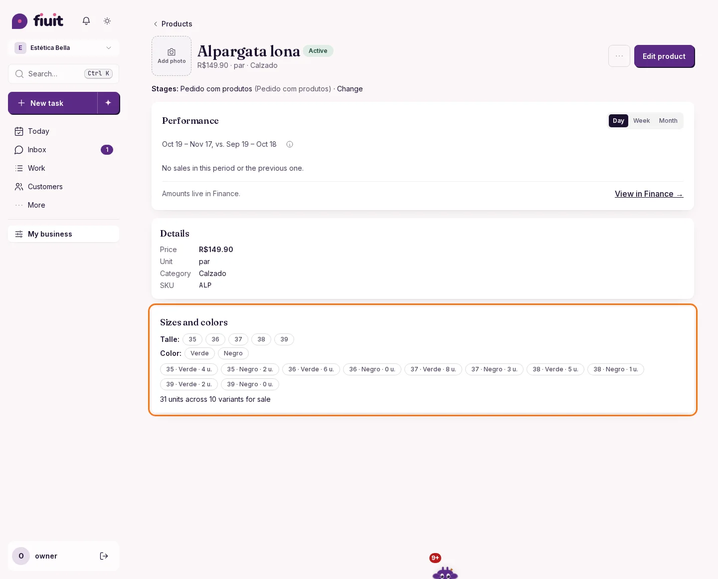
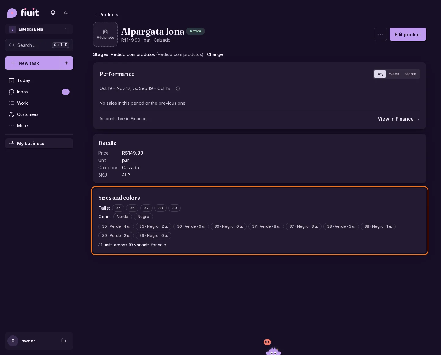
Product: the view is for looking, «Edit» is for changing

A product's page now shows a clear summary with no controls that change data. Everything is changed in «Edit», and day-to-day stock has its own «Adjust stock».

Read-only product view with sizes, colors and stock per variantRead-only product view with sizes, colors and stock per variant

What you get

  • A clear page: see the product at a glance, with no risk of changing something by accident.
  • All in one place: what you change, you change in «Edit».
  • Fast stock: when goods arrive, «Adjust stock» is one tap away.
Permalink
Improvement

My business opens on the catalog

The My business sections are now ordered Catalog, Team and Data, and the menu takes you straight to the catalog.

What you get

  • What you use most, first: you land right on your services and products.
  • A clearer order: Catalog, Team and Data, always in the same place.
Permalink
Improvement

Cleaner customer profile and editor

The customer profile shows only what exists and gets an «Add» button. The editor keeps the basics on top and the rest under «More data».

What you get

  • Less noise: no empty sections.
  • Everything at hand: «Add» offers what can be added.
  • Shorter editor: fits a phone without long scrolling.
Permalink
Improvement

Your bot replies in your customer's language and names the sizes

The bot answers in the language the customer writes in, tells them the sizes you have in stock and no longer gets stuck when listing products.

What you get

  • Each customer in their language: if they write in Spanish, the bot answers in Spanish, even if their profile says otherwise.
  • Sizes in sight: the bot tells them which sizes you have in stock for each product.
  • Lists that don't get stuck: showing several models with sizes and quantities no longer hands the chat to a person.
  • Extras stay on sale: a product tied to a service is still available in the bot's catalog.
Permalink
· 11 changes

Stock by spreadsheet, product from a photo and a shop that activates itself

Update the day's stock with a CSV, complete a product from its photo and add sizes, colors and stock to each combination. Ask Wagy about your catalog, switch projects from your phone and the desktop calendar floats.

Improvement

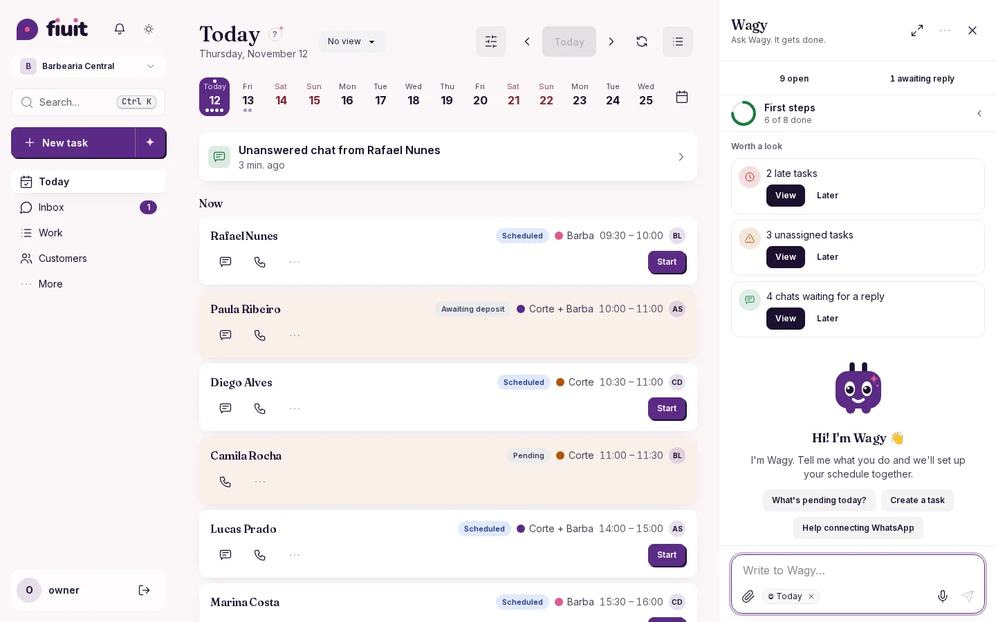
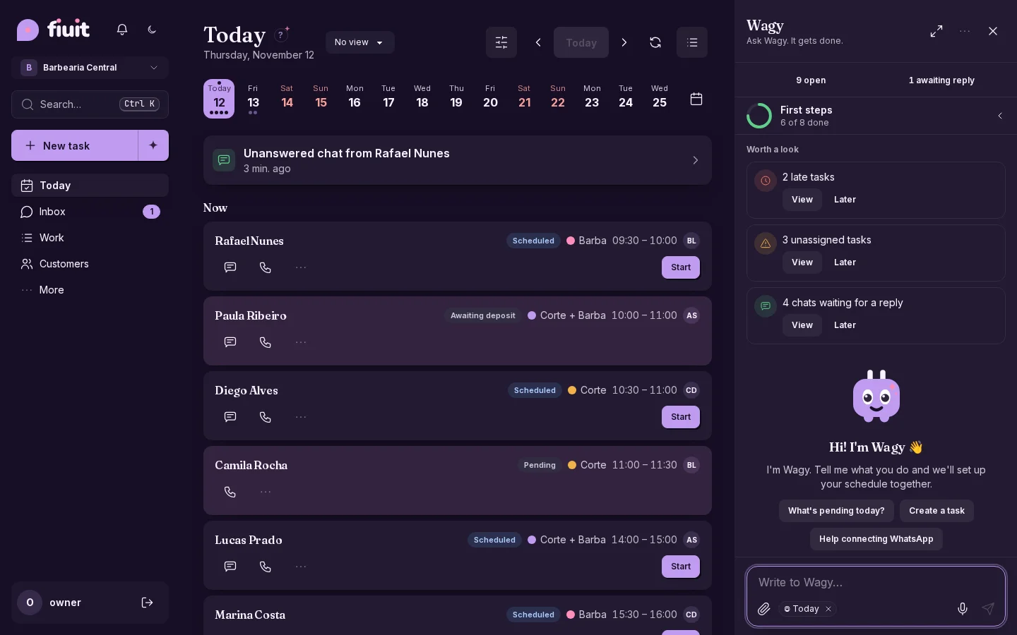
Wagy's chat, always in the same place

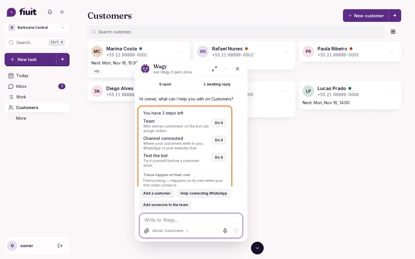
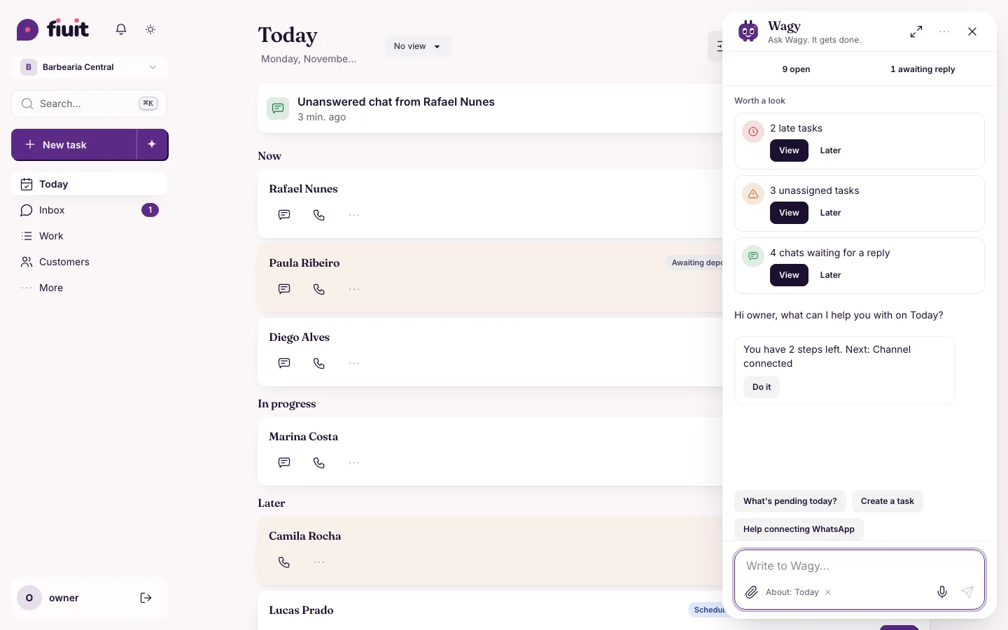
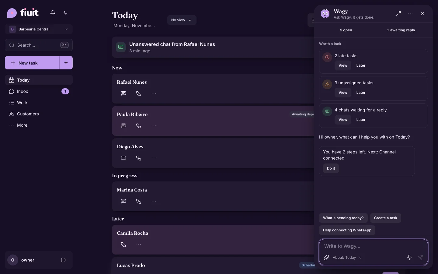
Wagy can be anywhere on the screen, but its chat always opens in the same place: you know where to look and it stays out of your way.

Today with Wagy's chat open at the bottom right and Wagy in its headerToday with Wagy's chat open at the bottom right and Wagy in its header

What you get

  • You always know where the chat is: it opens in the same place, no matter where Wagy is.
  • Only one Wagy on screen: when the chat opens, Wagy flies to its header and goes back to its spot when you close it.
  • More room to talk: on a computer the chat uses the full available height.
Permalink
Improvement

If you work alone, every order is already yours

When only one person can do the work, every new order, appointment or task goes straight to them: nothing is left unassigned to hand out.

What you get

  • Nothing is left without an owner: if one person does the work, every order lands straight in their list.
  • No extra questions for your customer: if there is only one person to choose, the customer doesn't have to choose.
  • Grow without setting anything up: when you add someone, new tasks are shared out the way you decide.
Permalink
Improvement

A shop that only sells products activates itself

Add your products and your business goes live: no need to invent a service or add someone to the team just to start selling.

What you get

  • Start selling right away: with your products added, your business is ready.
  • No extra steps: no need to invent a service for a shop that doesn't take appointments.
  • If you don't sell products: you need an active service and someone to serve it to activate your business.
Permalink
New

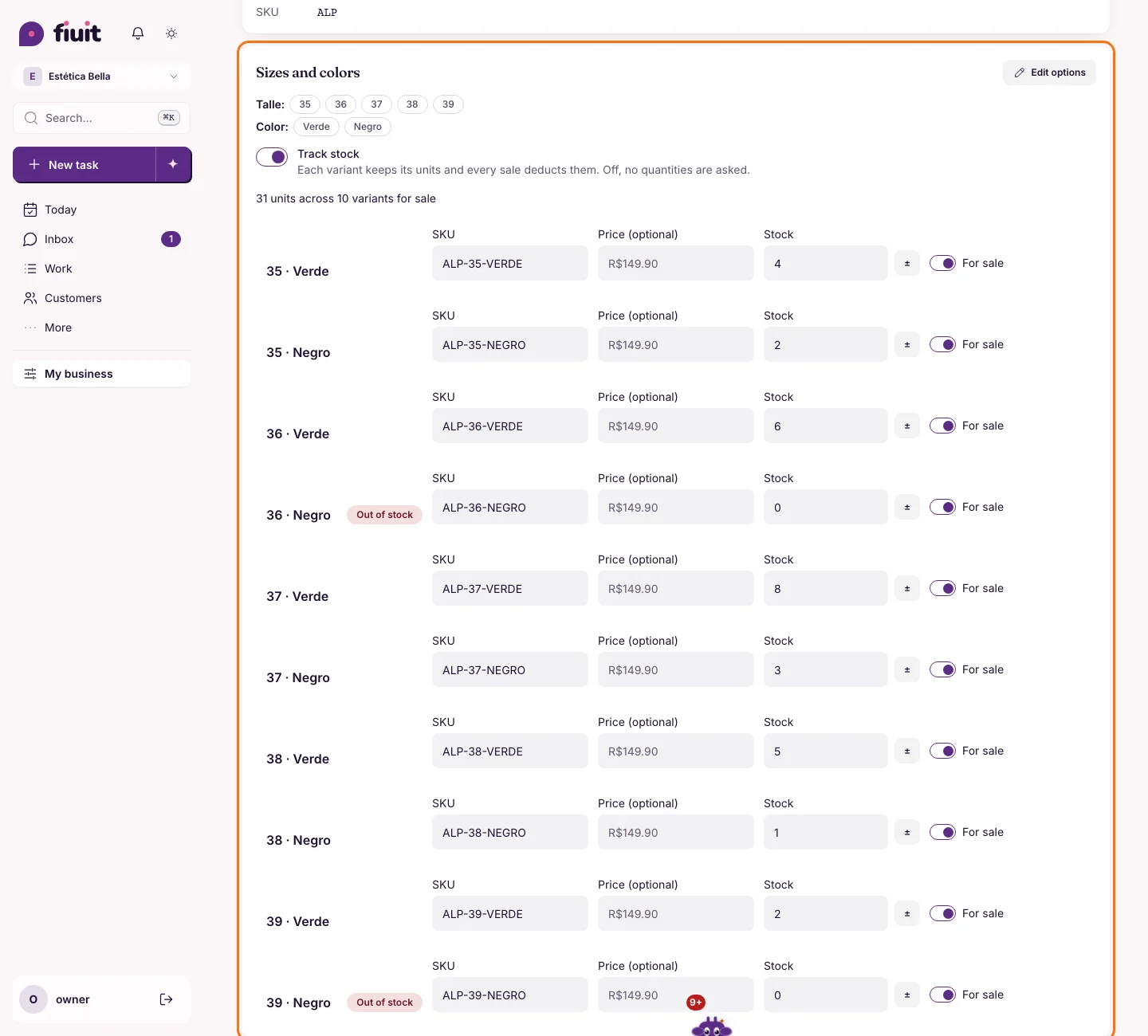
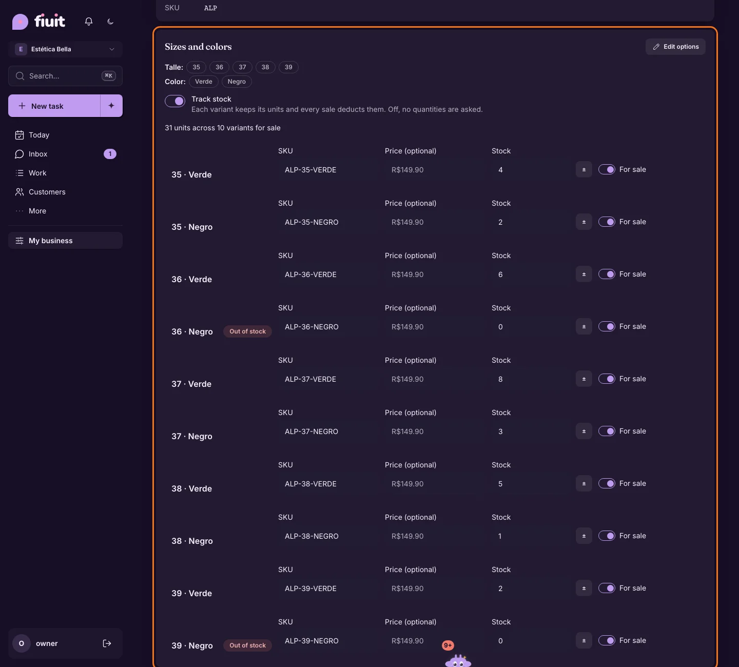
Sizes, colors and stock on every product

Add every size and color of each model in seconds, with its SKU and stock, and build bundles with their own price. The list warns you what is running out.

Espadrille detail with sizes 35 to 39 in green and black: each combination with its SKU, optional price and stock, and «Track stock» onEspadrille detail with sizes 35 to 39 in green and black: each combination with its SKU, optional price and stock, and «Track stock» on

What you get

  • Every model in all its sizes and colors: one product, every combination, no one-by-one setup.
  • Stock up to date: you know what is left of each size and color, and every adjustment is logged with its note.
  • Timely warnings: the list flags what sold out or is about to.
  • Bundles and combos: several products together for a single price, built in a minute.
Permalink
New

Your product fills itself in from the photo

Send a product photo and your AI proposes the category, color, material, a description that sells and the words your customers use to find it.

What you get

  • Complete listings without typing: category, color, material and a ready-to-sell description, from one photo.
  • Customers find it: adds the words people search with, like «flip-flop» or «green slide».
  • You decide: nothing is saved until you accept, and you always set the price.
Permalink
New

Update the day's stock with a CSV

Upload your system's daily file, check what changes and confirm. If you slip, undo it.

What you get

  • Real stock every day: upload your system's file and you're done.
  • No surprises: see how many products change, which weren't found (with their row) and big changes before confirming.
  • With or without sizes: finds each product by barcode, SKU or name; simple products get their stock too.
  • Quantities only: it never creates or deletes products or touches prices.
  • Undoable: undo puts the quantities back as they were.
Permalink

Week of November 9

· 5 changes

Cart and packs in chat, and product photos

Your bot builds the cart and sells packs, the product shows its photo and price, and your AI loads the product photos. Wagy notifies you from the customer's page and the day calendar pushes the list instead of covering it.

Improvement

Wagy speaks up from the customer page

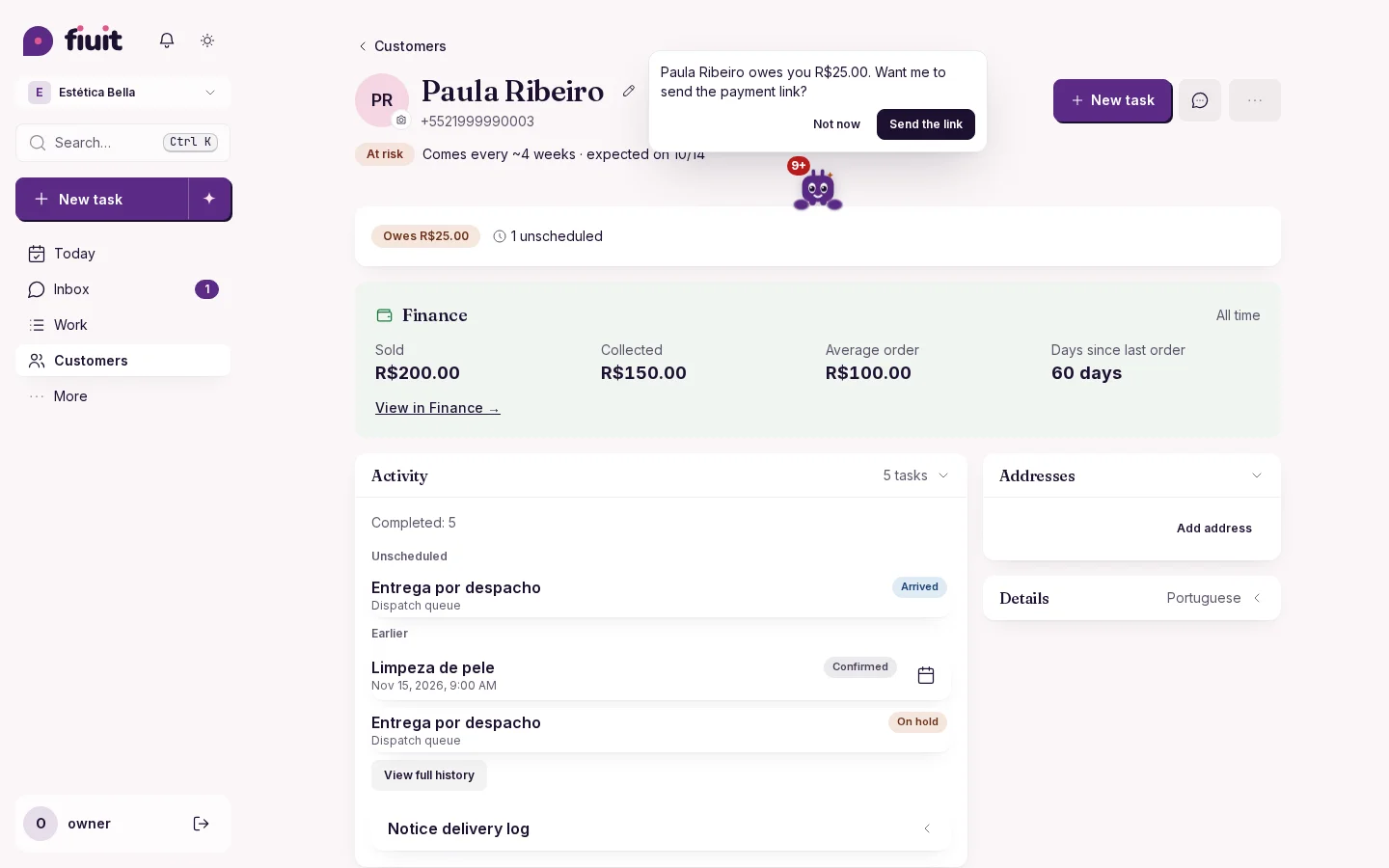
With a customer open, Wagy peeks out from behind the detail that matters —what they owe, how long since they last came, what is missing— and suggests what to do.

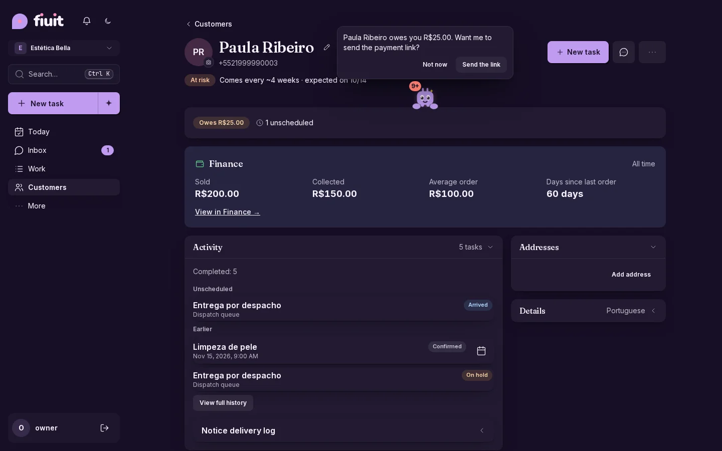
A customer page with Wagy peeking out from behind the balance: «owes you R$ 25.00, want me to send the payment link?»A customer page with Wagy peeking out from behind the balance: «owes you R$ 25.00, want me to send the payment link?»

The right heads-up, in the right place

  • Behind what matters: Wagy peeks out from behind the balance, the last visit or the missing detail, not from a corner.
  • Only with a reason: it comes from the customer's data, with no greetings or filler. No reason, no Wagy.
  • It suggests, you confirm: tap it and the action is ready in the chat.
  • It does not nag: if you dismiss it, it does not come back for the same reason that day.
Permalink
Improvement

Products now show their photo and price

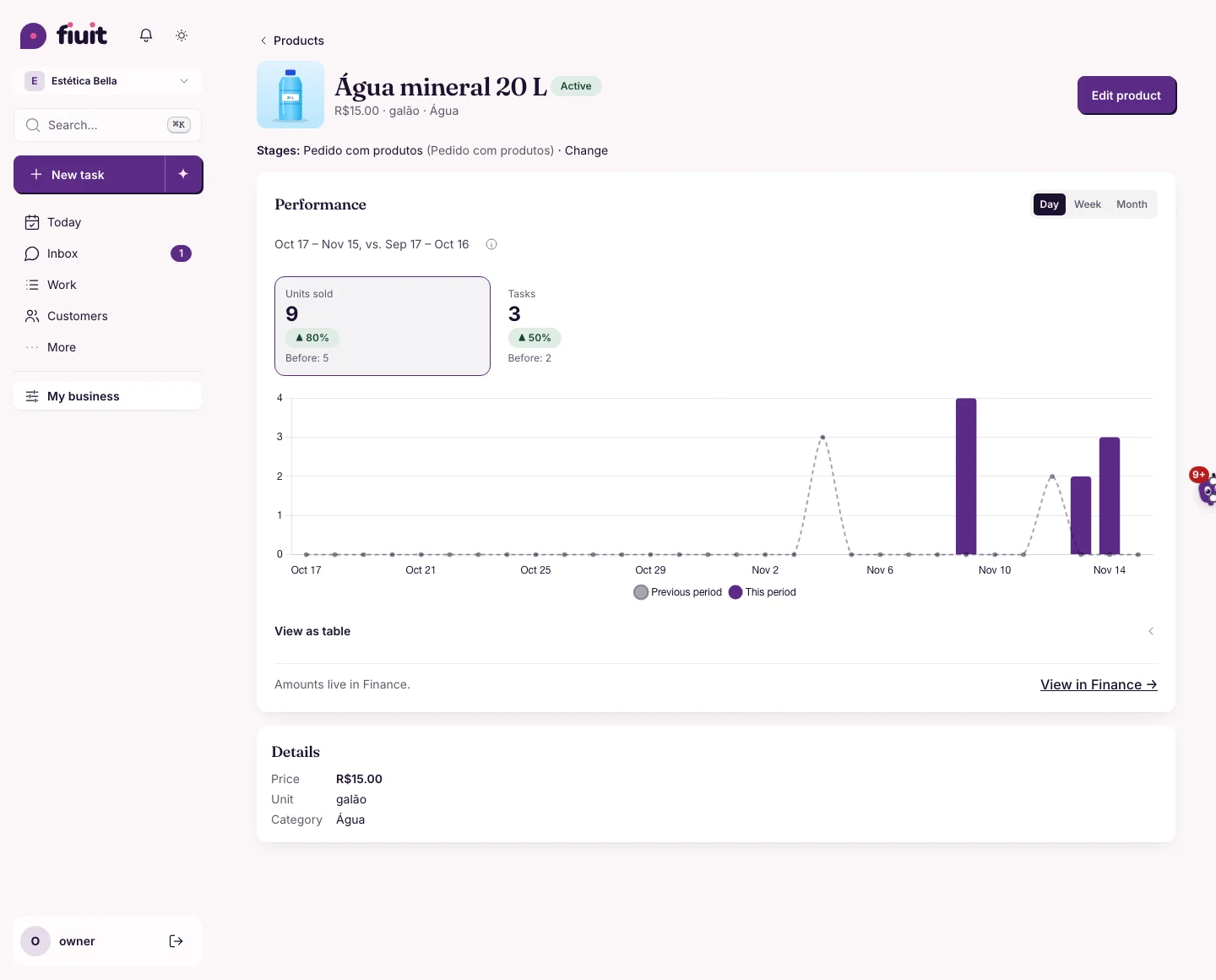
Open a product and see its photo next to the name and its price at the top, no scrolling. No photo or no price? One tap to add it.

Product detail with the photo to the left of the name and the price next to the unit and categoryProduct detail with the photo to the left of the name and the price next to the unit and category

A product you can read at a glance

  • Photo next to the name: the same one as in the list; tap it to enlarge it.
  • Price at the top: next to the unit and category, and also under Details, in the same format as the list.
  • What's missing, one tap away: with no photo you get «Add photo»; with no price, «No price» with «Add price» (never «R$ 0.00»).
Permalink
New

Your product photos, uploaded by your AI

Ask ChatGPT or Claude to set each product's photo: the one your bot sends in chat. No more uploading them one by one.

What you get

  • A complete catalog in one go: your AI creates the products and sets their photos too.
  • From a file or a link: use the photo you have or the one already published on your site.
  • Your customers see it in chat: it's the same photo your bot sends when offering products.
  • Safe: before saving you see what will change, and only public images up to 2 MB are accepted.
Permalink
New

Your bot builds the cart and sells bundles

Your customers order several products in the same chat, add and remove them, and see the total before confirming. Bundles and combos are offered on their own, at the right moment.

What you get

  • Complete orders in one chat: your customers add, remove or change quantities and see the total right away.
  • Bigger tickets: the bot offers your bundle when it pays off, only once and without pushing.
  • No math by hand: Fiuit works out the prices and the total; the order arrives ready to charge.
Permalink
· 10 changes

Wagy on the task, the whole map and standard document fields

Wagy keeps you company with the task open, peeks over the bar and takes the whole screen on mobile. The map uses the whole screen, your document variables use standard names and your assistant understands «clear my calendar».

Improvement

An empty day is no longer a lost day

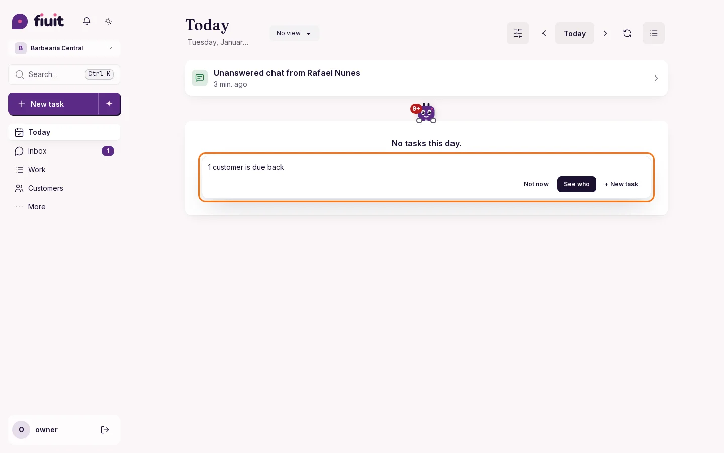
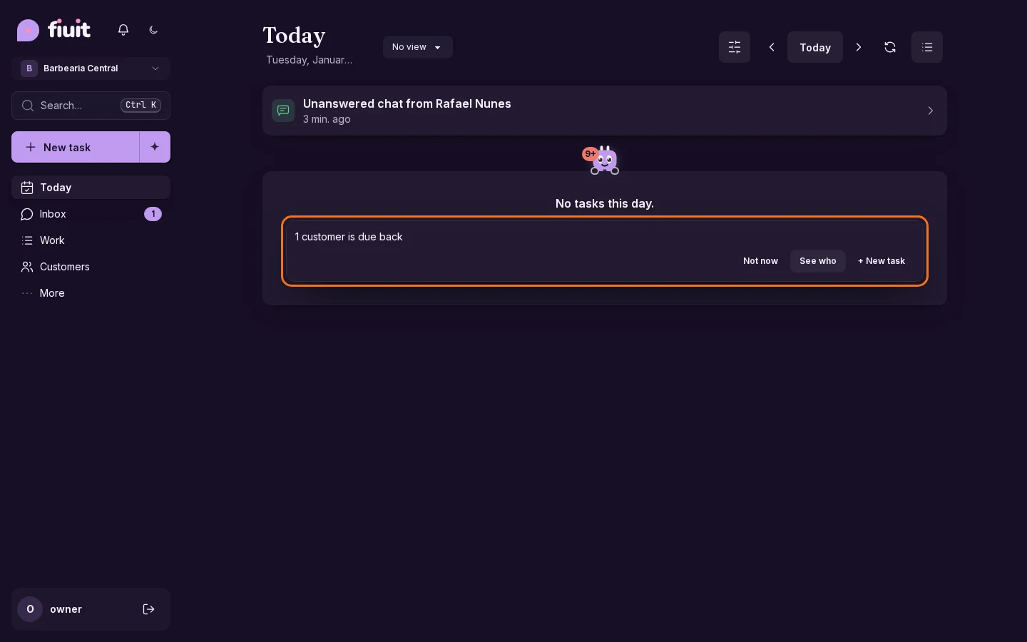
When your schedule is empty, your assistant tells you who usually comes and is due back, and lets you invite them or share your link in one tap.

Today with no tasks: Wagy, resting on the empty card, says how many customers are due back, with «See who» and «New»Today with no tasks: Wagy, resting on the empty card, says how many customers are due back, with «See who» and «New»

What you get

  • Fill the gaps: see right away who usually comes and is due back.
  • One help, the right one: share your link, connect a channel or create the first one, depending on what's missing.
  • No noise: if you prefer quiet, mute your assistant and only the text stays.
Permalink
New

Your assistant suggests the reply and tells you when someone is waiting

If you'd rather answer yourself, your assistant leaves each reply ready to send in one tap, and lets you know when a customer has been waiting a while.

You decide what goes out

  • Reply ready: every customer message arrives with a suggested reply, in your business's tone and with its data.
  • Nothing goes out on its own: send, edit or discard it in one tap.
  • The next step at hand: book the requested time, prepare the quote or send the payment link, with your confirmation.
  • Nobody is left waiting: if a customer waits more than 10 minutes during your hours, we alert you in the panel and on Telegram, with the reply ready to send from the alert.
Permalink
Improvement

Your assistant understands «remove my calendar»

Ask your assistant to remove your calendar and it unassigns you without deactivating anyone; it also warns you if a team is left empty.

Clear changes, no surprises

  • Your calendar, without deactivating anyone: your assistant unassigns you and the person or spot keeps working.
  • Tells you where it comes from: it says which member your account is assigned to before changing anything.
  • No changes that contradict each other: it never proposes deactivating and renaming the same thing at once.
  • Warns before leaving a team empty: you see which services would have nobody to do them.
Permalink
Improvement

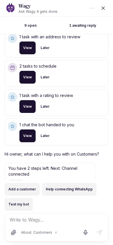
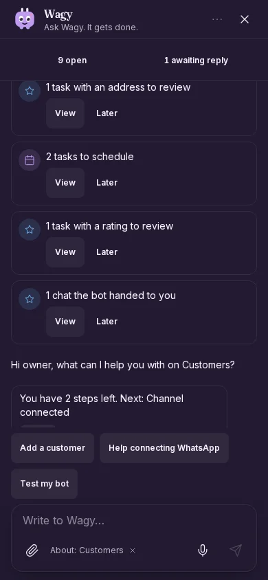
Wagy fills the whole screen on your phone

On a phone, the Wagy chat opens full screen, with a single button to close it.

Wagy chat full screen on a phone, with only the close button (on mobile)Wagy chat full screen on a phone, with only the close button (on mobile)

The whole screen for the conversation

  • No wasted space: on a phone the chat takes the full height and width.
  • One window button: Close. The rest (new chat, previous chats) stays in «…».
  • With the keyboard: the text field stays in view while you type.
  • On a computer: everything stays the same, with the floating bubble.
Permalink
Improvement

Wagy peeks over the bar and has a life of its own

Wagy lives peeking over the bottom bar with both hands, ducks when you scroll and, when it has something to say, peeks out from behind what is missing.

Wagy peeking over the bottom edge of the screen with both handsWagy peeking over the bottom edge of the screen with both hands

An assistant that feels alive

  • Peeking, never in the way: it lives on the bottom edge and ducks when you scroll past.
  • Your way: move it to a side, a corner or hang it from the top.
  • Tells you where it matters: it peeks out from behind what is missing.
Permalink
Improvement

Wagy keeps you company with the task open

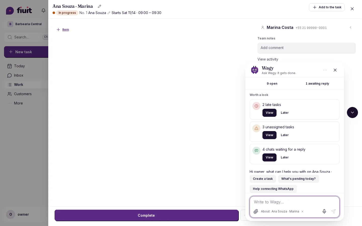
Wagy peeks in at the edge of the task and opens the chat on top, without closing it.

Task detail with the Wagy chat open on top, without closing the taskTask detail with the Wagy chat open on top, without closing the task

Chat without losing the task

  • At the edge: with the task open, Wagy peeks in from the side of the detail. On mobile it sits above the action bar and does not cover it.
  • The chat opens on top: the task stays open and pinned as the context of the conversation.
  • One Wagy only: while the task is open, the one on the background screen is hidden.
  • Your way: on mobile, swipe the chat down to close it and Wagy peeks in again.
Permalink
Improvement

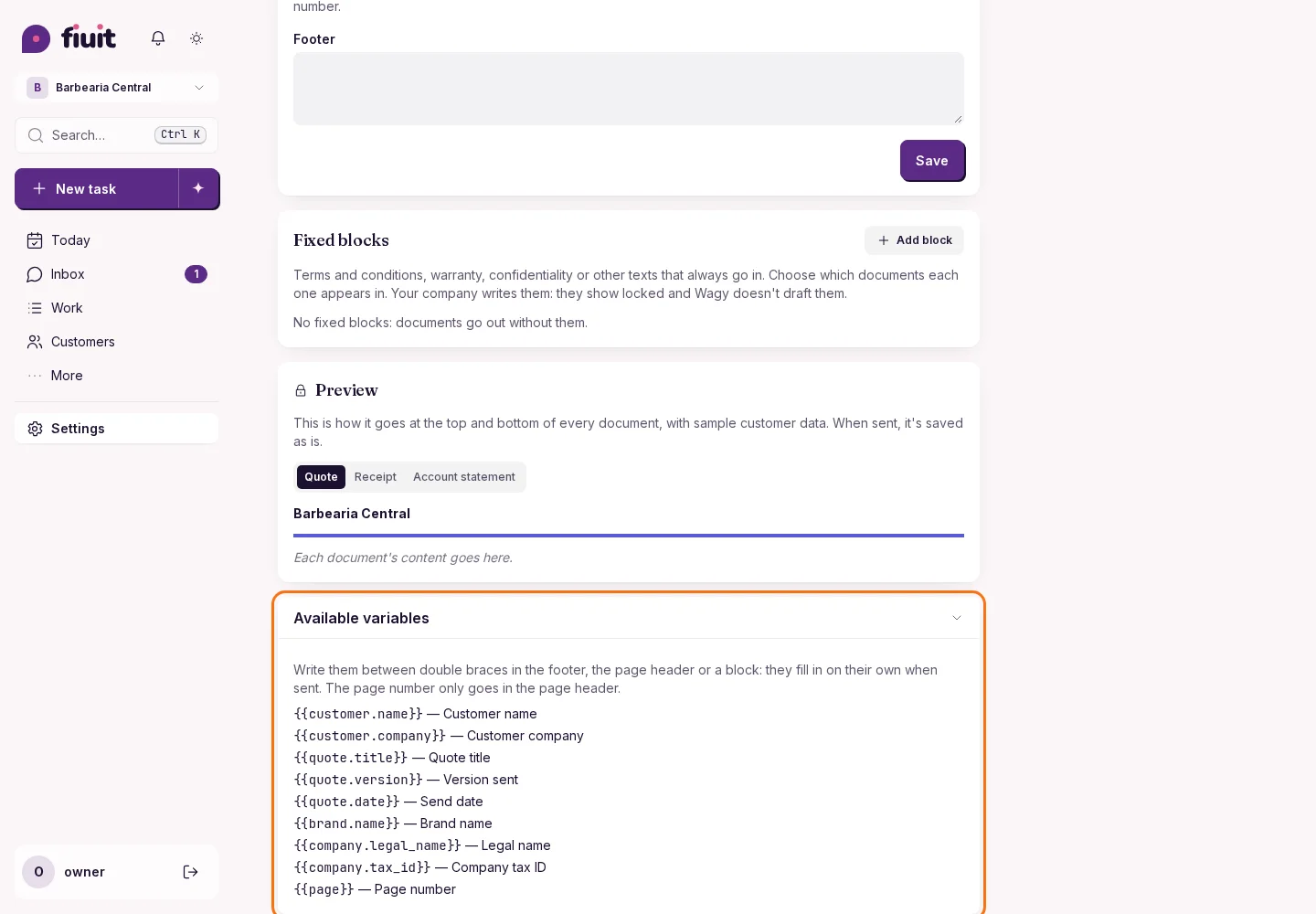
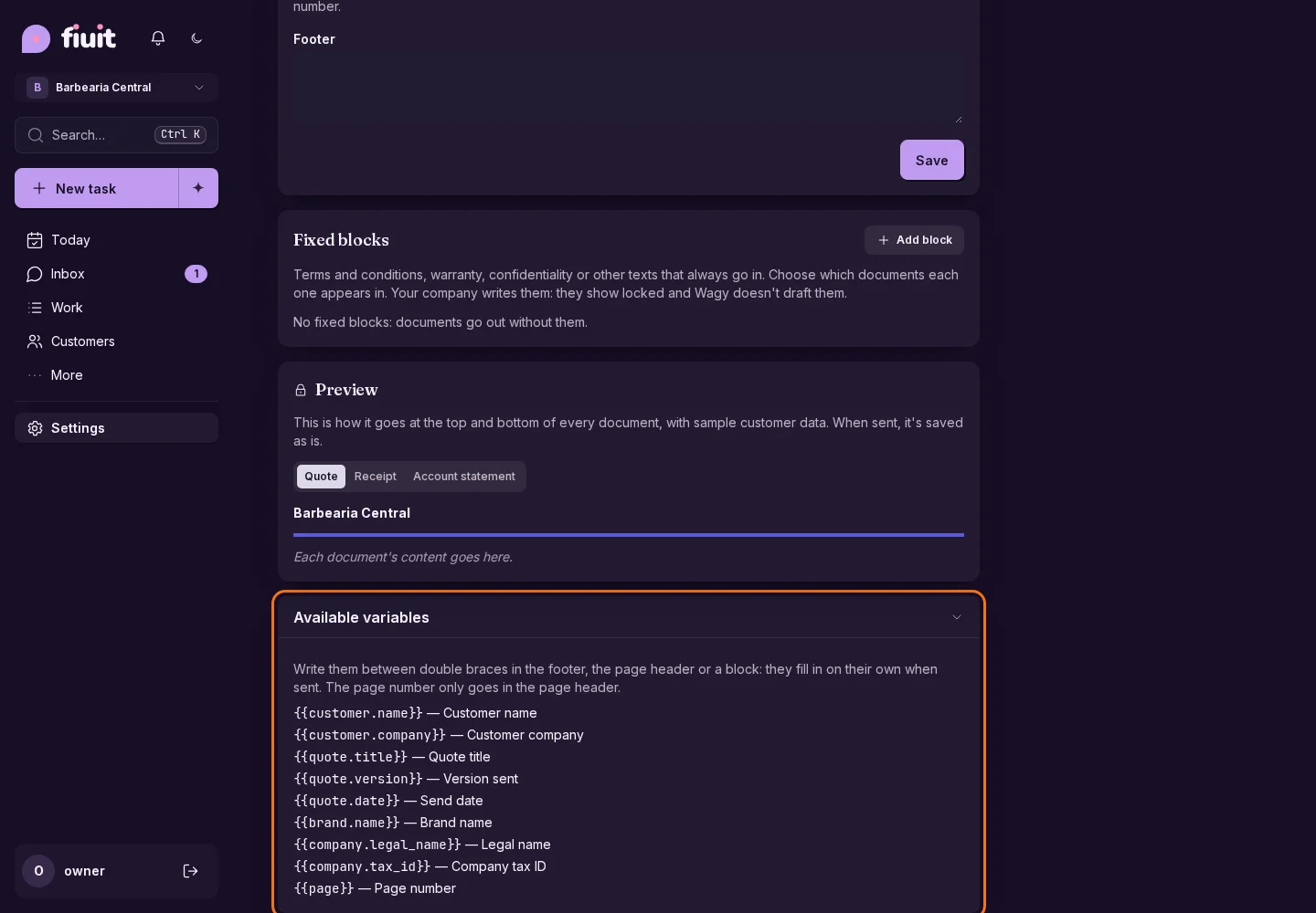
Document variables with standard names

Personalize the footer, header and fixed texts of your quotes with variables that have standard names, the same in every language.

Available document variables with names and explanations in EnglishAvailable document variables with names and explanations in English

What you get

  • The same names in every language: your document variables are written the same in Portuguese, Spanish and English.
  • Every variable explained: the list of available variables says, in your language, what each one fills in.
  • No surprises: a variable that doesn't exist isn't saved, so a half-finished text never reaches your customer.
Permalink
Improvement

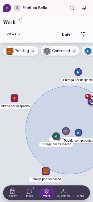
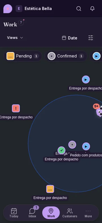
The map fills the whole screen

On mobile, the map reaches the bottom, the menu floats on top and the task groups sit at the top.

Work map full screen on mobile: the group legend floats at the top as chips and the bottom menu floats over the map (on mobile)Work map full screen on mobile: the group legend floats at the top as chips and the bottom menu floats over the map (on mobile)

More map, fewer bars

  • The map shows edge to edge, also behind the bottom menu.
  • The groups with their counts are at the top, always in view, and no longer take a strip at the bottom.
  • The card of a tapped pin is never covered by the top bar or the menu.
  • On desktop and iPad the map was already full-bleed: there only the groups' place changes.
Permalink
New

Tell us how you work and your stages are ready

Tell your assistant how a job goes from start to finish and it sets up your business stages, with what is recorded at each one.

Your stages, made to fit

  • Tell it like you would tell someone new: written or dictated, in your own words.
  • Stages ready to use: each one with what is recorded (photos, signature, a checklist, the quote) and who fills it in.
  • The customer in the loop: where they approve the quote and when they are notified.
  • Always in your control: you see the procedure before confirming, adjust it by chatting or undo it.
Permalink
Improvement

All of a task's money in one block

What to charge, what was already collected and what is left, together and without repeating any number. And if the customer owes other tasks, one line takes you to their account.

Task with no amount to charge: no payment block is shownTask with no amount to charge: no payment block is shown

Less noise, more clarity

  • One block: what to charge, what was collected and what is left, with no numbers repeated above and below.
  • Clear payment: when it is paid you read «Paid ✓»; if a plan covers it, «Covered by plan».
  • The customer's debt in one line: if they owe other tasks, the line takes you to their account (or to Finance if you can't see their profile).
  • Visible adjustments: a value changed by hand shows what it was, and a deposit shows as included in what was collected.
Permalink
· 9 changes

Durations per booking, views by rhythm and fixed headers

Choose how long each booking lasts, find each customer by their rhythm and save views that show what you pick. Headers stay fixed while scrolling Work, quotes, receipts and statements share one identity, and Wagy stays at the height you choose.

Improvement

Wagy floats on top and no longer shifts your screen

Your assistant's chat opens as a floating bubble: drag it away if it gets in the way, or dock it to the side if you prefer.

Floating Wagy chat with margins and a minimize button, without shifting the pageFloating Wagy chat with margins and a minimize button, without shifting the page

A bubble that stays out of the way

  • One tap away: the button beside the chat minimizes it; on phones, the chat fills the whole screen.
  • The screen stays put: your tables and cards do not move.
  • It adapts: it grows with the chat and, if it covers what Wagy is pointing at, it finds a clear spot.
  • Your way: drag it, or dock it to the side; Wagy remembers on that device.
Permalink
Improvement

One-line help, with the next step at hand

Ask your assistant what a screen is and it answers in one line, with an action to take there or the full guide.

Wagy explains Today in one line, with «Help me…» and «See the guide»Wagy explains Today in one line, with «Help me…» and «See the guide»

Less text, more done

  • One line: your assistant tells you what each screen is, in your business's words.
  • The next step one tap away: it offers one or two actions from that screen, like creating a task or collecting a payment.
  • The guide when you want it: long explanations stay in the documentation, one tap away.
  • Cleaner forms: no help icons; what you need to decide is in one line under the field.
Permalink
Improvement

Wagy stays at the height you choose

Move Wagy to the top, middle or bottom of the edge: it remembers your choice on each screen.

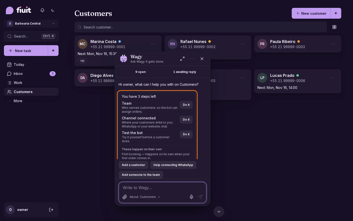
Wagy near the top of the left edge in Customers

At your height

  • Wagy remembers the height and side you choose for each screen.
  • It adjusts to the free space between the bars, including when the screen size changes.
  • No setup needed, and there is still only one Wagy per screen.
Permalink
Improvement

Views that show what you choose

Each view opens the same filters across your devices. Completed and cancelled work never counts as hidden in views of open work.

What you gain

  • Each view opens the same filters across your devices. Completed and cancelled work never counts as hidden in views of open work.
Permalink
Improvement

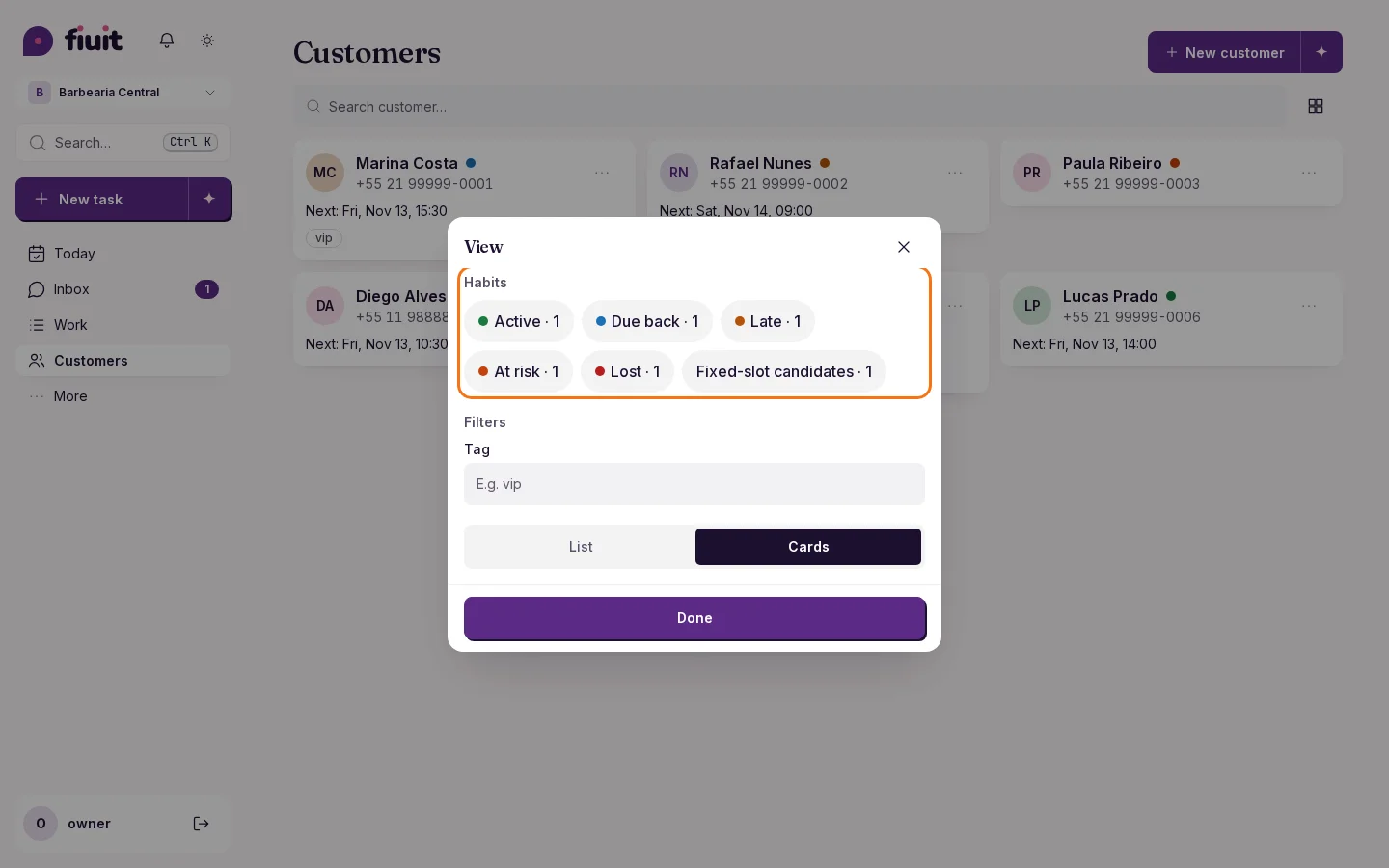
Find each customer by their rhythm

Filter your customers by status, from active to lost, and see how many are in each one.

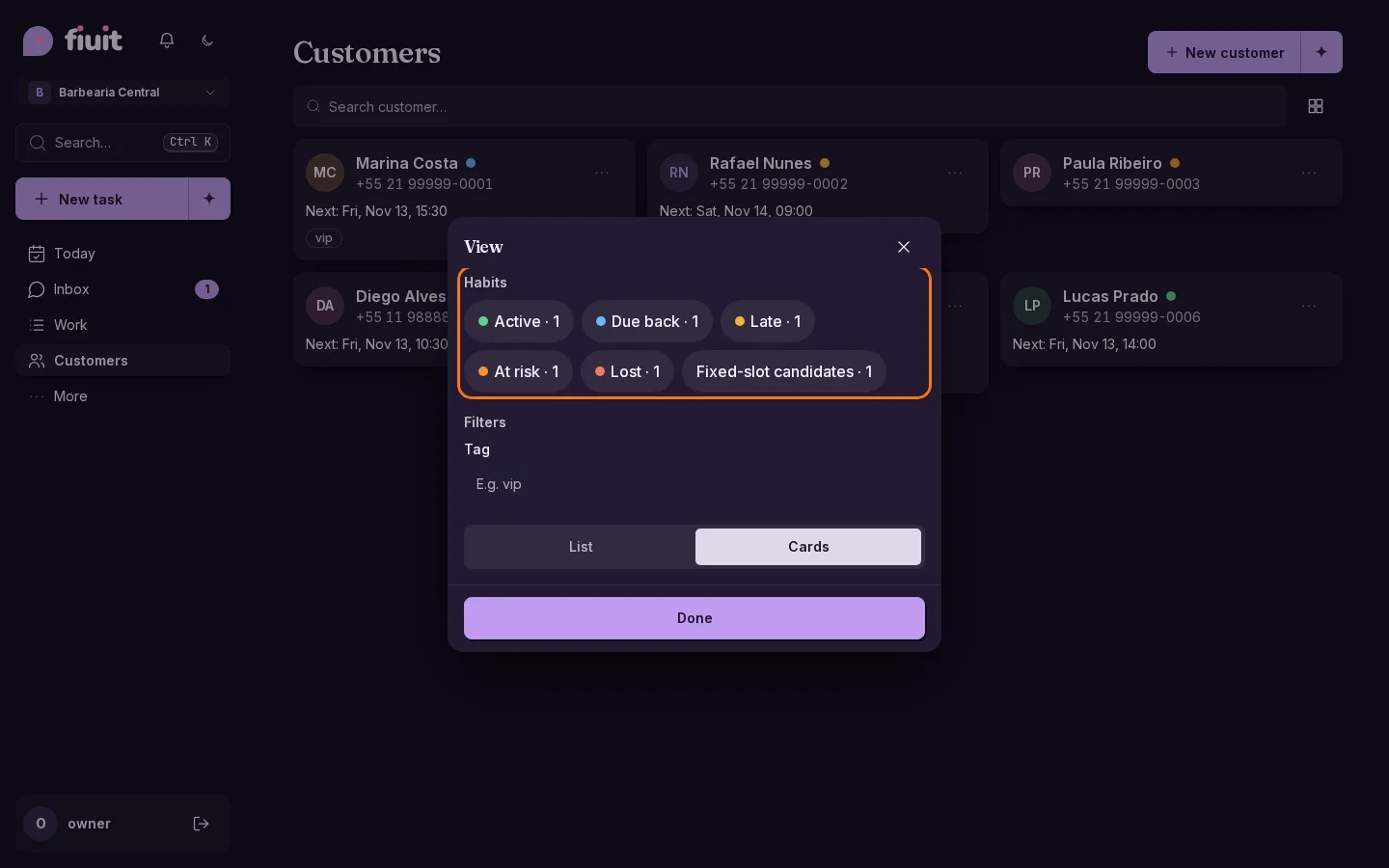
Customers «View» sheet with the Habits filters: Active, Due back, Late, At risk, Lost and Fixed-slot candidates, each with its count and colored dotCustomers «View» sheet with the Habits filters: Active, Due back, Late, At risk, Lost and Fixed-slot candidates, each with its count and colored dot

What you get

  • Every status: find your active customers and the ones at risk, not just the late ones.
  • The count up front: you know how many customers are in each status before filtering.
  • The same color as the list: each filter matches what you see next to each name.
Permalink
Improvement

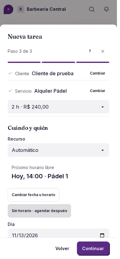
Choose how long each booking lasts

Choose a duration beside the service and find slots with enough free time for the whole booking.

New task on mobile: padel court rental, a 2 h duration with its price and an available time. Spanish interface.

The time you need

  • Available durations and their prices are visible before you choose a time.
  • A two-hour booking occupies a single two-hour block, with availability for the entire period.
Permalink
Improvement

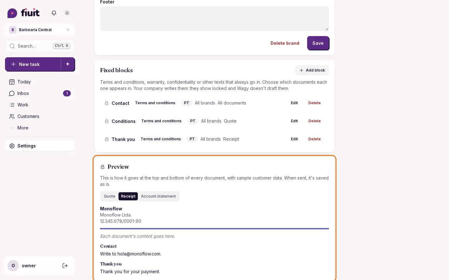
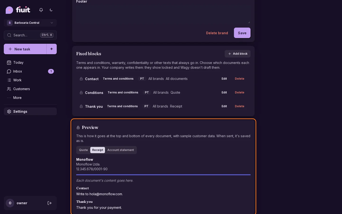
One identity for quotes, receipts and statements

Your logo, details and fixed texts go on every document you send your customer, and each text appears only where it belongs.

Settings → Documents: receipt preview with its fixed blocksSettings → Documents: receipt preview with its fixed blocks

What you get

  • Your brand on everything you send: quote, receipt and account statement share the same logo, colors and company details.
  • Each text in its place: conditions in the quote, thanks for the payment in the receipt.
  • No extra work: what you already set up stays the same and, if you set up nothing, your project's brand is used.
Permalink
Improvement

Pinned headers while you scroll Work

Board columns, Calendar days, the Timeline and List groups keep their title in view as you scroll down.

Clear orientation

  • Each Board column scrolls by itself without moving the others.
  • Days, people and groups stay pinned on top while you move through the content.
  • The last item of each view can be lifted above the menu at the bottom.
Permalink
Improvement

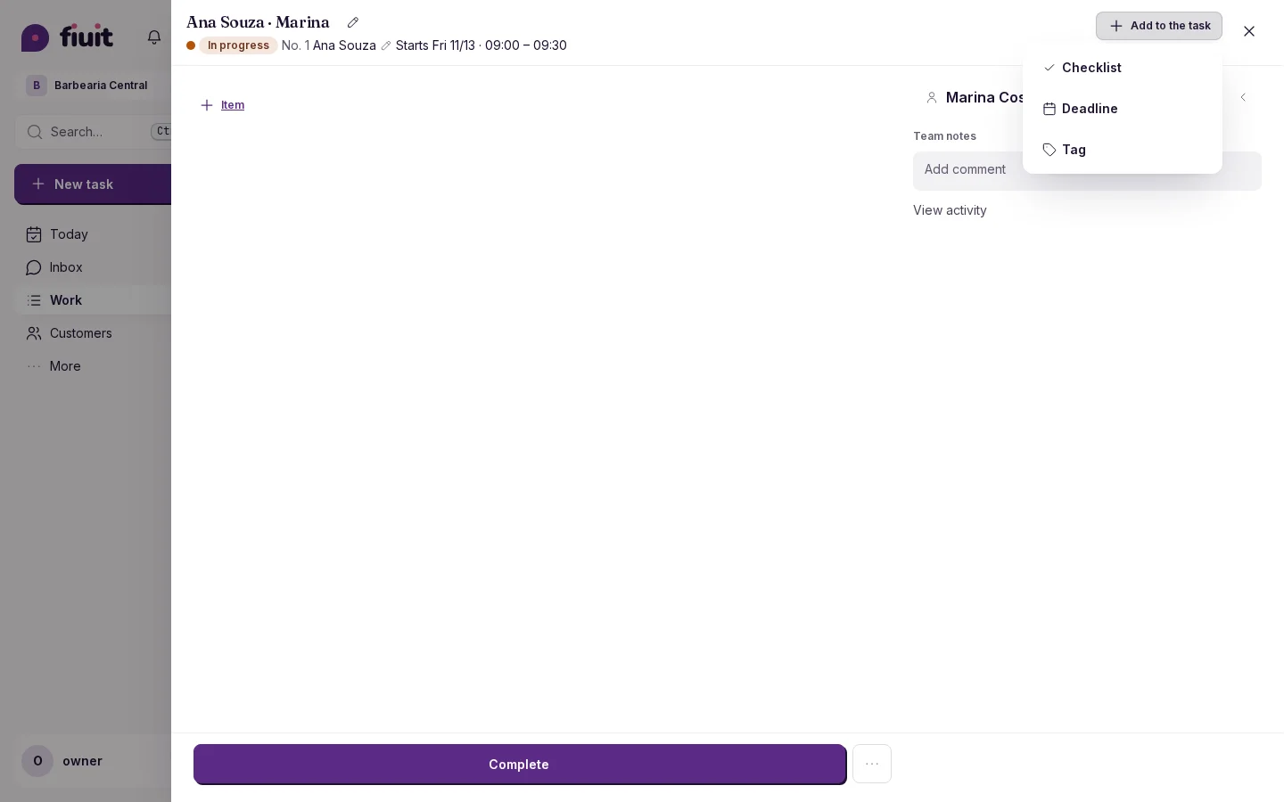
Everything in its place inside the task

What a task is missing is added from its header, and budget items from their own table.

Separate «Add to the task» and «+ item» — Work → a task

Less noise, more clarity

  • Add to the task only offers what is missing; if nothing is missing the button is hidden.
  • + item lives inside the budget, with part, service and discount.
  • Photos are requested in the stages and comments are always on the task.
Permalink
· 10 changes

Fiuit Fiscal, companies in Customers and the version in sight

Fiuit Fiscal issues Brazilian invoices from every charge, companies and their people show up in Customers and each customer's status is visible at a glance. The workload follows the charges, you find work with no assignee and you always know which version you're on.

Improvement

More room to talk with Wagy

The chat uses its full width and brings its controls together in the header.

Wagy uses the full panel width — Wagy chatWagy uses the full panel width — Wagy chat

A more comfortable conversation

  • Cards and the text field make the most of the available space on phones, tablets and desktop computers.
  • Controls sit together in the header, with the same layout in light and dark themes.
Permalink
New

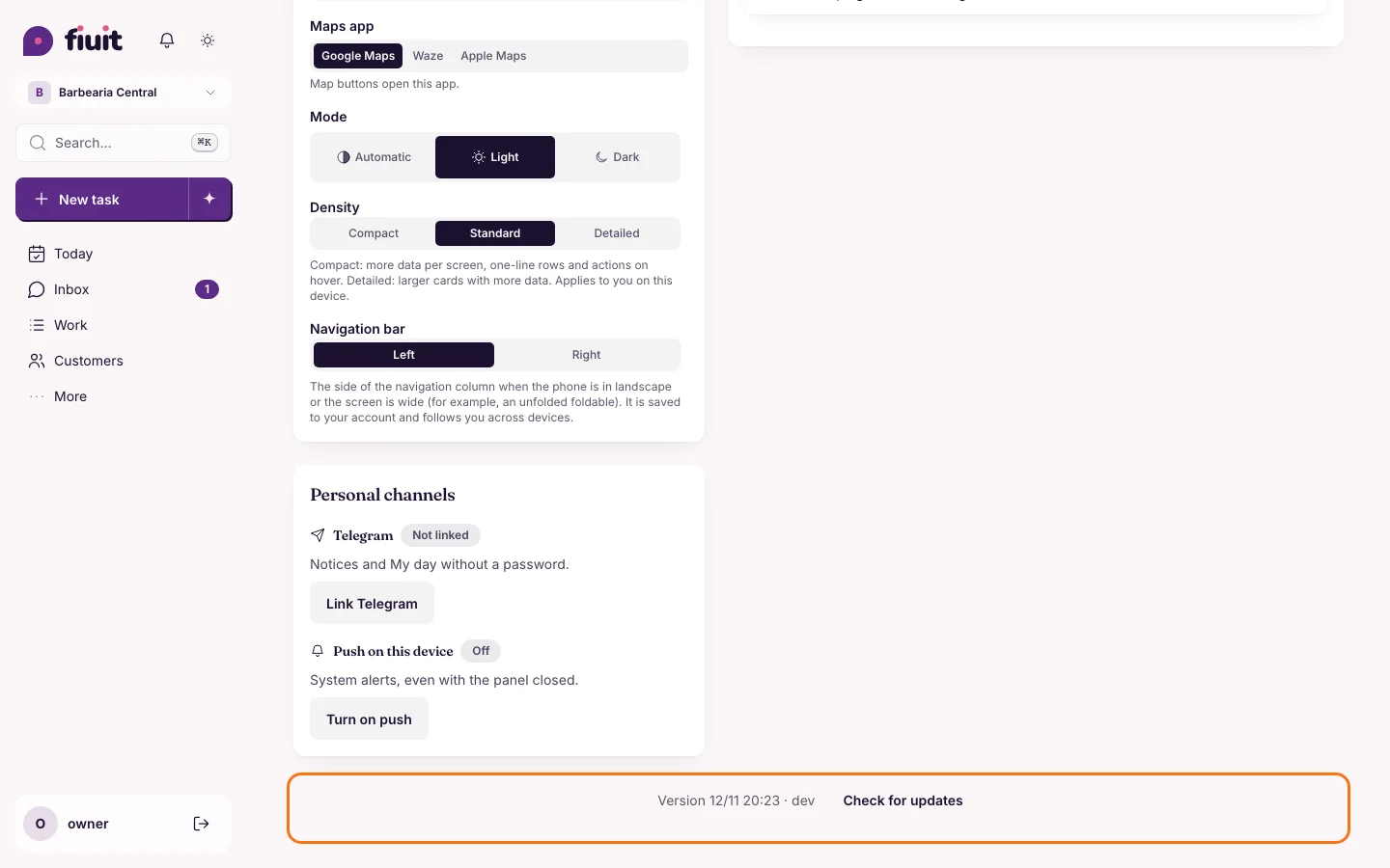
Always know which version you're on

You can check your version in My account and look for the latest with one tap, so nobody is left out of date.

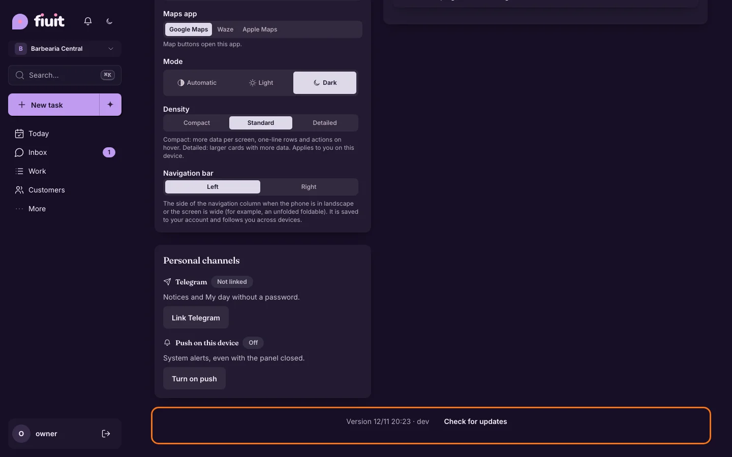
Bottom of My account with the version and the «Check for updates» buttonBottom of My account with the version and the «Check for updates» button

What you get

  • No doubts: if something looks different on two devices, check the version and fix it right away.
  • Always up to date: the new-version notice also shows when you open the app on your phone.
Permalink
Improvement

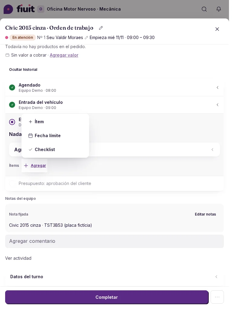
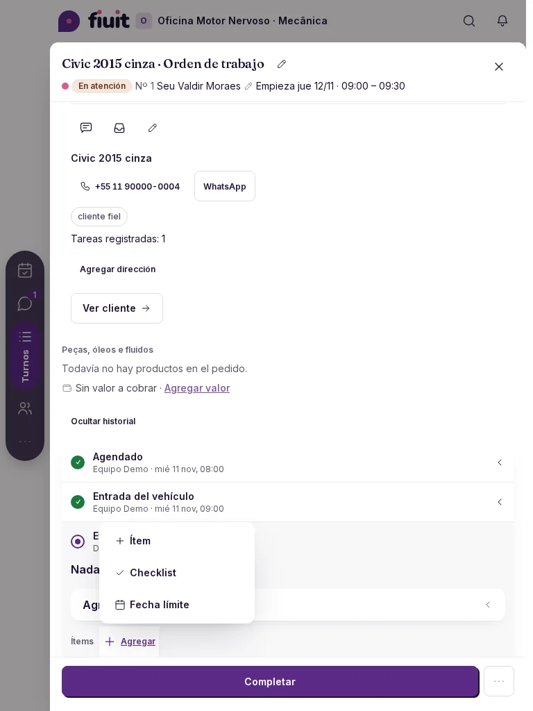
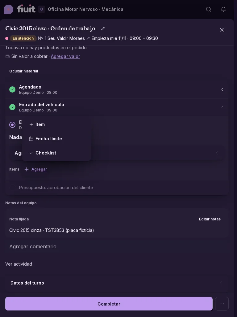
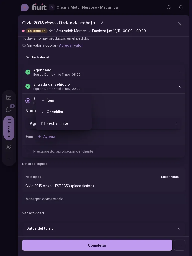
Cleaner tasks, with everything in Add

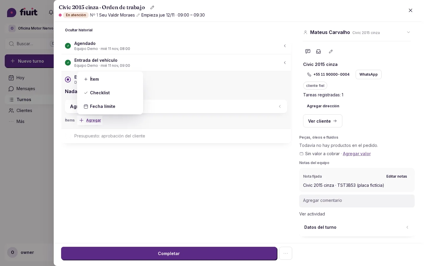
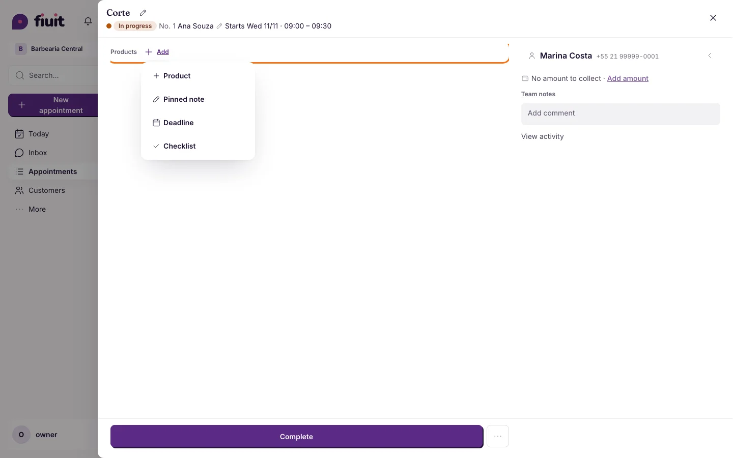
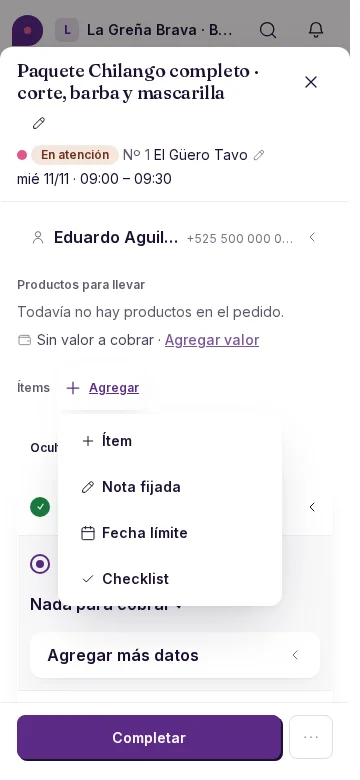
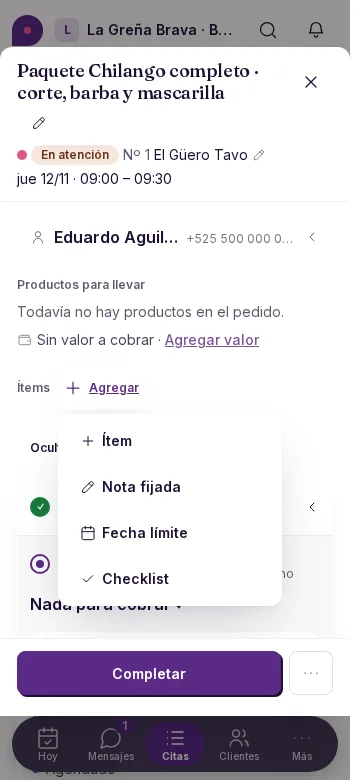
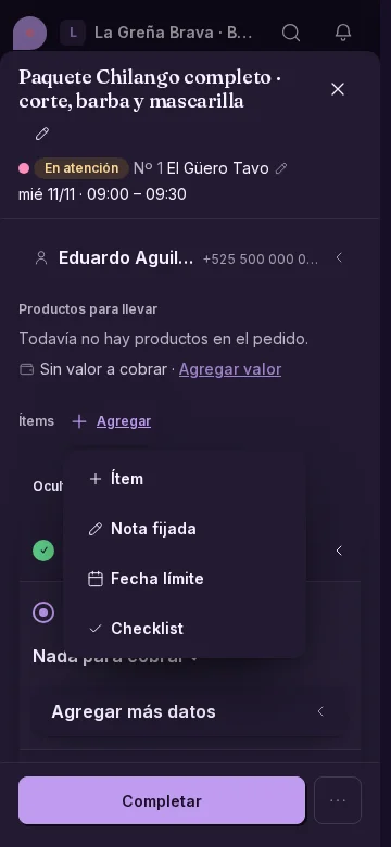
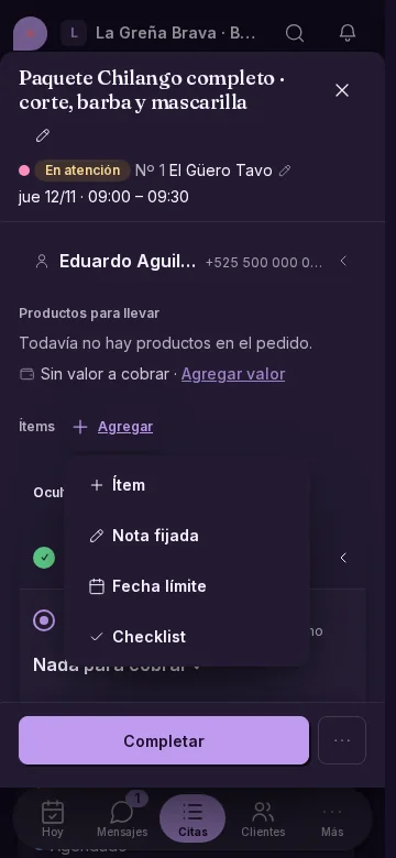
Add items or set an amount from one menu, without empty rows in your tasks.

Empty task: only AddEmpty task: only Add

Less empty space

  • One menu to start adding details to a task.
  • Amounts and items appear as you add them, with Add below.
  • Product, service and discount are also available from Add, without an «Items» heading or a separate gray button.
Permalink
Improvement

Fiuit Fiscal, for businesses in Brazil

Issuing NFS-e with Fiuit Fiscal is offered to businesses in Brazil; in other countries, your panel stays free of options you cannot use.

What you get

  • A panel that fits you: you see Fiuit invoicing only if your business is in Brazil.
  • No extra options: in other countries you keep issuing with your usual provider.
Permalink
Improvement

Each customer's status at a glance

A colored dot next to each customer tells you whether they are active, due back soon or drifting away.

Customers list with a colored dot next to each name: green Active, blue Due back, yellow Late, orange At risk and red LostCustomers list with a colored dot next to each name: green Active, blue Due back, yellow Late, orange At risk and red Lost

What you get

  • At a glance: you know who to call without opening every profile.
  • Clear names: Active, Due back, Late, At risk and Lost.
  • Nothing to set up: it works on its own; if you want other rules, Wagy changes them with your OK.
Permalink
New

Companies and their people in Customers

Add companies with their logo, tax ID and website, and note who works at each one. Also from ChatGPT or Claude.

Company profile with its website and peopleCompany profile with its website and people

What you get

  • Companies with their own profile: legal name, tax ID, address, website and logo, in one place.
  • Who's who: each person shows the company they work at and their role, and the company shows all its people.
  • Add them with your AI: ask ChatGPT or Claude «register this company and Ana from purchasing» and it fills everything in, logo included.
  • Find them fast: search by company name or tax ID.
Permalink
· 11 changes

A lighter task, a glass bar and quotes with your identity

The task gets lighter, with a single «+ Add» and past stages on one line. The mobile bar is glass and moves aside when you rotate, the panel remembers what you collapse and quotes carry your company's identity.

Improvement

Wagy peeks from behind cards and you can move it anywhere

Wagy peeks over a card or the screen edge, hands gripping the border, and tapping it opens the chat with that card's context.

One Wagy, better hidden

  • Peeks with its hands: you see the antennas, the eyes and two little hands gripping the card's border; the body stays behind. Now and then it rises a little to spy, and it blinks.
  • You move it: drag it and it hides at the nearest card or edge. If you move it, it respects that spot.
  • Never in the way: it never covers text, buttons or fields, and respects "Hide for today", "Mute suggestions", reduced motion and dark mode.
Permalink
Improvement

Writing to Wagy, made easier

Wagy's chat now has a single full-width box: write, attach or speak without losing space, and the box grows as you type.

Wagy chat with the full-width composer and controls insideWagy chat with the full-width composer and controls inside

What you get

  • More room to write: a single full-width box, no extra rows.
  • Everything at hand: the paperclip, microphone and send always stay inside the box.
  • Attachments show above the text, with a thumbnail you can remove.
Permalink
New

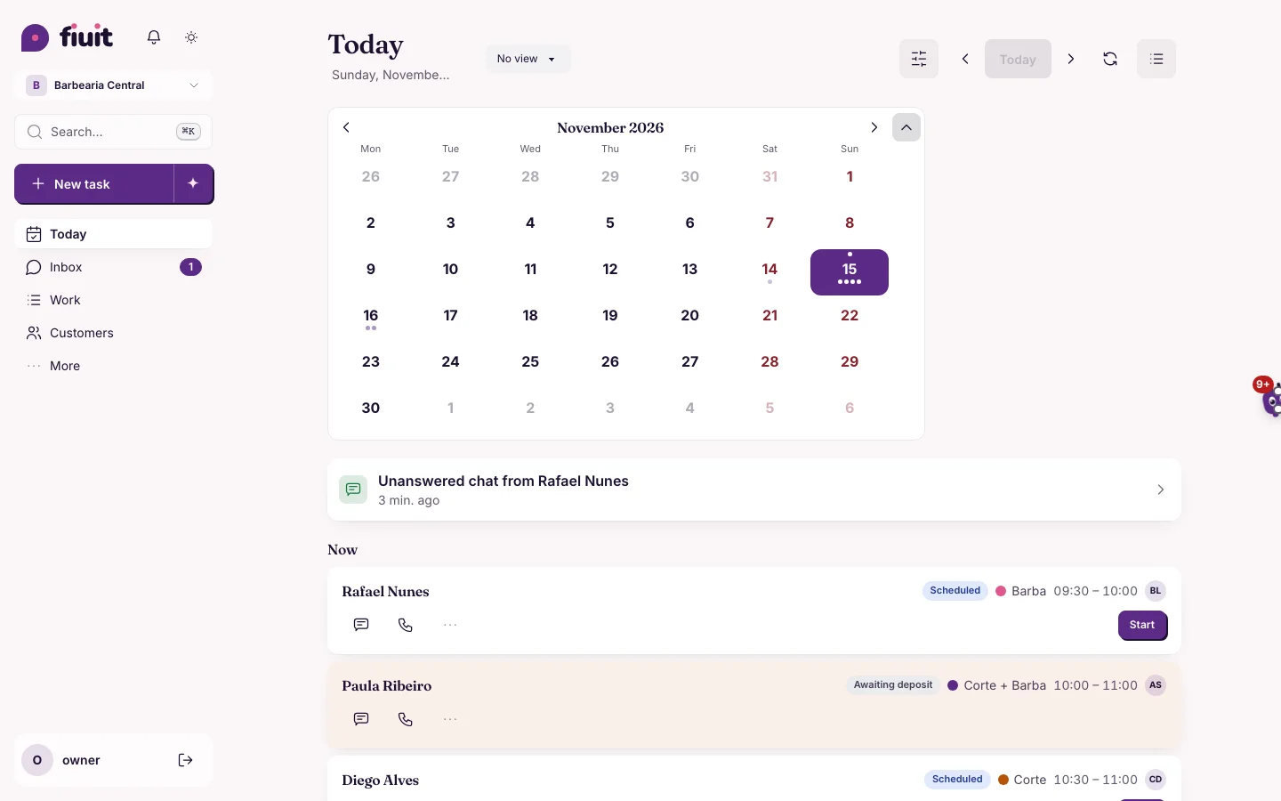
Your week at a glance: days with their load in dots

See which days are busy and which have room, without opening each one.

Clearer which day works best

  • Only when you want it: tap the date and the line of days appears; it takes no room on the screen.
  • Load at a glance: 1 to 4 dots on each day, from the softest to the strongest tone, based on how busy your business usually is.
  • One single line: the week expands into the month and folds back, with no second grid.
  • Instant summary: press and hold a day and see the essentials without opening it.
Permalink
Improvement

Options for your activity

Tasks offer actions you can use, ordered by your business activity.

Workshop: After, Desktop, Light

Options for your activity

  • The task menu is ordered by the business activity. Changing its words only changes names: it does not enable actions. Each option respects your permission, the task state and its data; photos and signatures appear if the service declares them. With Items turned off, you can use the other blocks and edit existing lines, without adding new ones.
  • When payment is the main step and no payment link is available, «Record payment» is highlighted; once paid, the stage becomes the main action again.
  • The main action stays fixed at the bottom, above the phone navigation bar. When you rotate the phone or use a wide screen, it leaves the navigation column clear on your chosen side. On desktop, it spans the task column.

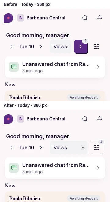
Before and after

  • Compare the same task with its past and current stages at all three sizes.
BeforeAfter
WorkshopDesktopLightBeforeAfter
WorkshopDesktopDarkBeforeAfter
WorkshopiPadLightBeforeAfter
WorkshopiPadDarkBeforeAfter
Workshop360 pxLightBeforeAfter
Workshop360 pxDarkBeforeAfter
BarbershopDesktopLightBeforeAfter
BarbershopDesktopDarkBeforeAfter
BarbershopiPadLightBeforeAfter
BarbershopiPadDarkBeforeAfter
Barbershop360 pxLightBeforeAfter
Barbershop360 pxDarkBeforeAfter
DeliveryDesktopLightBeforeAfter
DeliveryDesktopDarkBeforeAfter
DeliveryiPadLightBeforeAfter
DeliveryiPadDarkBeforeAfter
Delivery360 pxLightBeforeAfter
Delivery360 pxDarkBeforeAfter
Permalink
Improvement

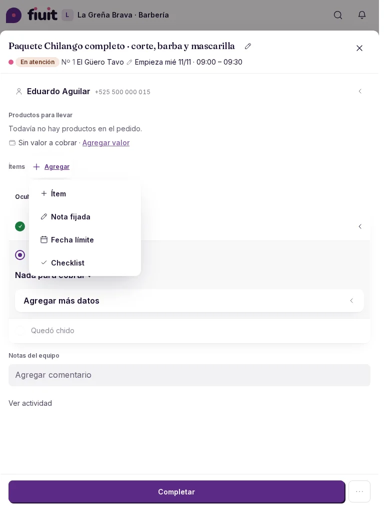
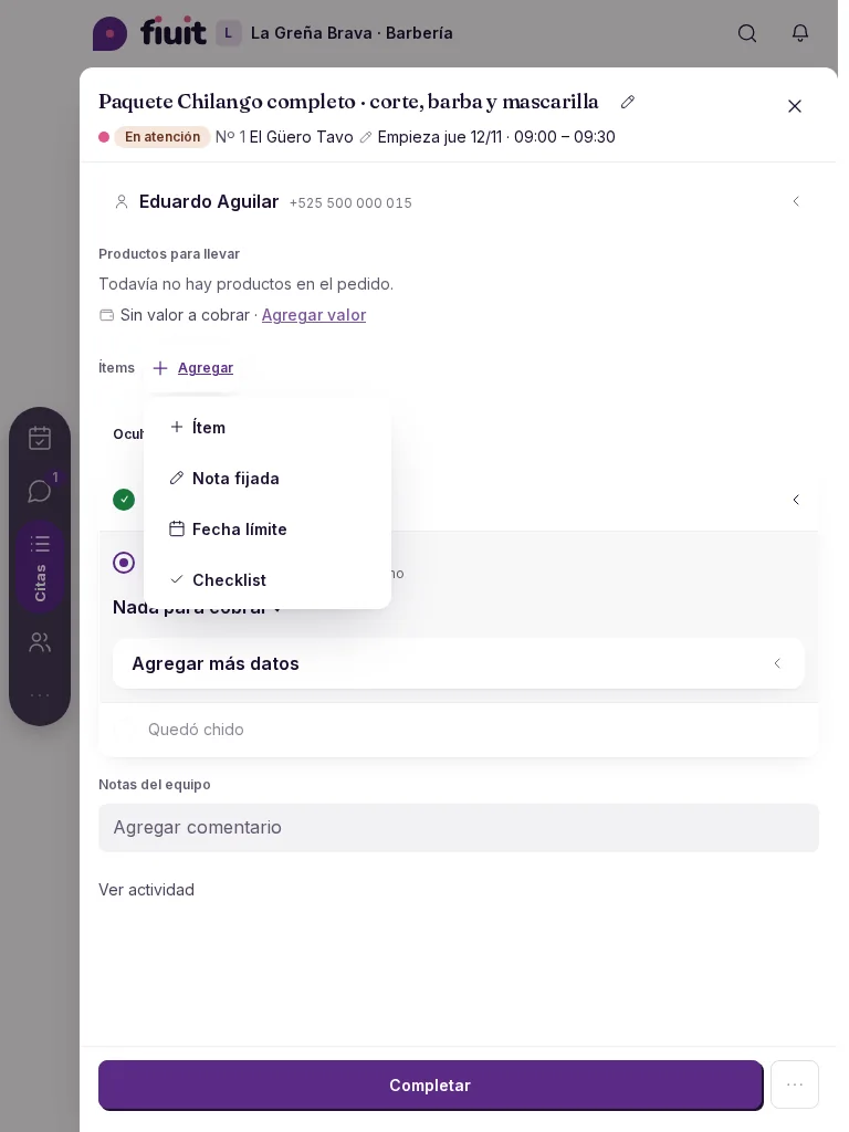
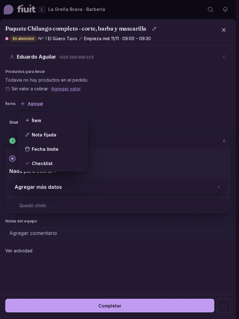
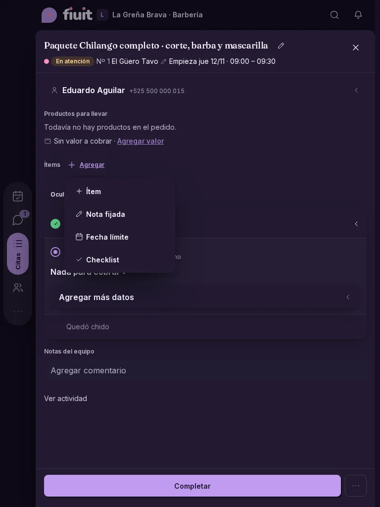
A lighter task: one «+ Add» menu and past stages on one line

The task detail shows only what has content and folds what already happened.

Barbershop task: «+ Add» offers product, note and due dateBarbershop task: «+ Add» offers product, note and due date

A lighter task

  • The single «+ Add» replaces the loose item, checklist and due-date buttons. What the task already has leaves the menu; when a block is emptied it disappears from the task and returns to the menu.
  • The item name comes from the business vocabulary: «Part» for the shop, «Consumption» for the club, «Product» for the barbershop and deliveries. Each business can adapt these names with Wagy's help.
  • Past stages sit on one line («✓ first —— +N stages —— ● current»); with no stages (a simple appointment) the line does not show.
  • No «(required)» on every field: the button says «N fields missing». Photo notices move into a «?».
  • Two-line header and a main button as wide as the task column on desktop; on mobile, full width at the bottom.
Permalink
Improvement

The panel remembers what you collapse

Each team member sees screens the way they left them: collapsed sections stay that way across records and visits.

Everyone, their own way

  • Your team no longer has to collapse the same section on every record.
  • What each person chooses is theirs: it doesn't change what others see.
  • Your choice is remembered in the browser you use; on another phone or computer, choose it again.
Permalink
Improvement

Without AI, your team takes the conversation

If the AI quota runs out or you pause the AI, the bot sends a clear message and hands you the conversation.

A person, no detours

  • Clear message: the customer reads that someone on the team will continue, with no talk of quotas or AI.
  • No menus: no numbered options for the customer to guess; the conversation comes straight to you.
Permalink
New

Quotes with your company's identity

Set your quotes' header, footer and terms once, also for each brand you sell.

What you get

  • Your identity in every quote: logo, colors and company details at the top, and your footer at the bottom.
  • Several brands: if you sell several lines, each one with its own logo and details.
  • Conditions that stay put: terms, warranty and confidentiality always go in, exactly as you wrote them.
Permalink
Improvement

The phone bar in glass, and on the side when you rotate

Phone navigation is a floating glass bar. With the phone in landscape, or on a wide screen, it becomes a column on the side.

Work on a phone with the glass bar at the bottom and Work highlighted

What you get

  • A lighter bar: it floats over the screen, lets content show through, and only the active tab carries its name.
  • Uses the width: in landscape or on an unfolded foldable, navigation moves to the side and content gets the full height.
  • Your side: the column sits on the left or the right, whichever is more comfortable.
  • Nothing covered: Wagy moves to the opposite side.
Permalink
· 6 changes

Shorter Today and Work bars, and Wagy from the edge

The Today and Work bar is shorter, with «Mine | All» and Focus in Filters, and empty states speak like your business. Add your services without typing everything, and Wagy helps from the edge and on empty screens.

Improvement

Wagy no longer gets in the way: it peeks from the edge

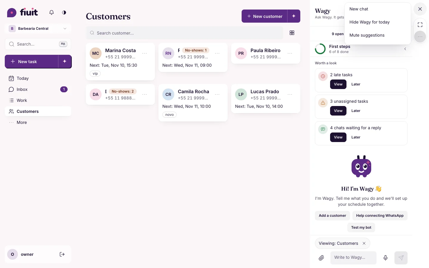
Wagy hides at the edge of the screen and only pops out when it has something to say. Chat controls sit in a column at the side.

Customers with Wagy's chat open on the right: the column with ✕, expand and “…”, and the menu with New chat, Hide for today and Mute suggestions

What you get

  • Nothing covered: Wagy no longer floats over your buttons or the end of a list.
  • Pops out when useful: with an empty state, a half-filled form or something pending, and goes back to the edge if you move on.
  • Your side, your day: pick the side, hide it for today or mute its suggestions.
  • Tidy chats: «New chat» starts from scratch and the previous one stays in «Previous chats», read only.
Permalink
Improvement

Today's empty states speak your business's language

Empty-state buttons use the name your business gives its work, and tell you when the team has something.

Empty-state buttons and phrases come from the business vocabulary, and with «Mine» empty you see what the team has.

An empty state that speaks your business's language

  • Your vocabulary: empty-state buttons and phrases use the name your business gives its work.
  • With «Mine» empty: it counts what the team has and offers «See All».
  • Booking link: only shows if your page is published.
Permalink
New

Load your services without typing everything

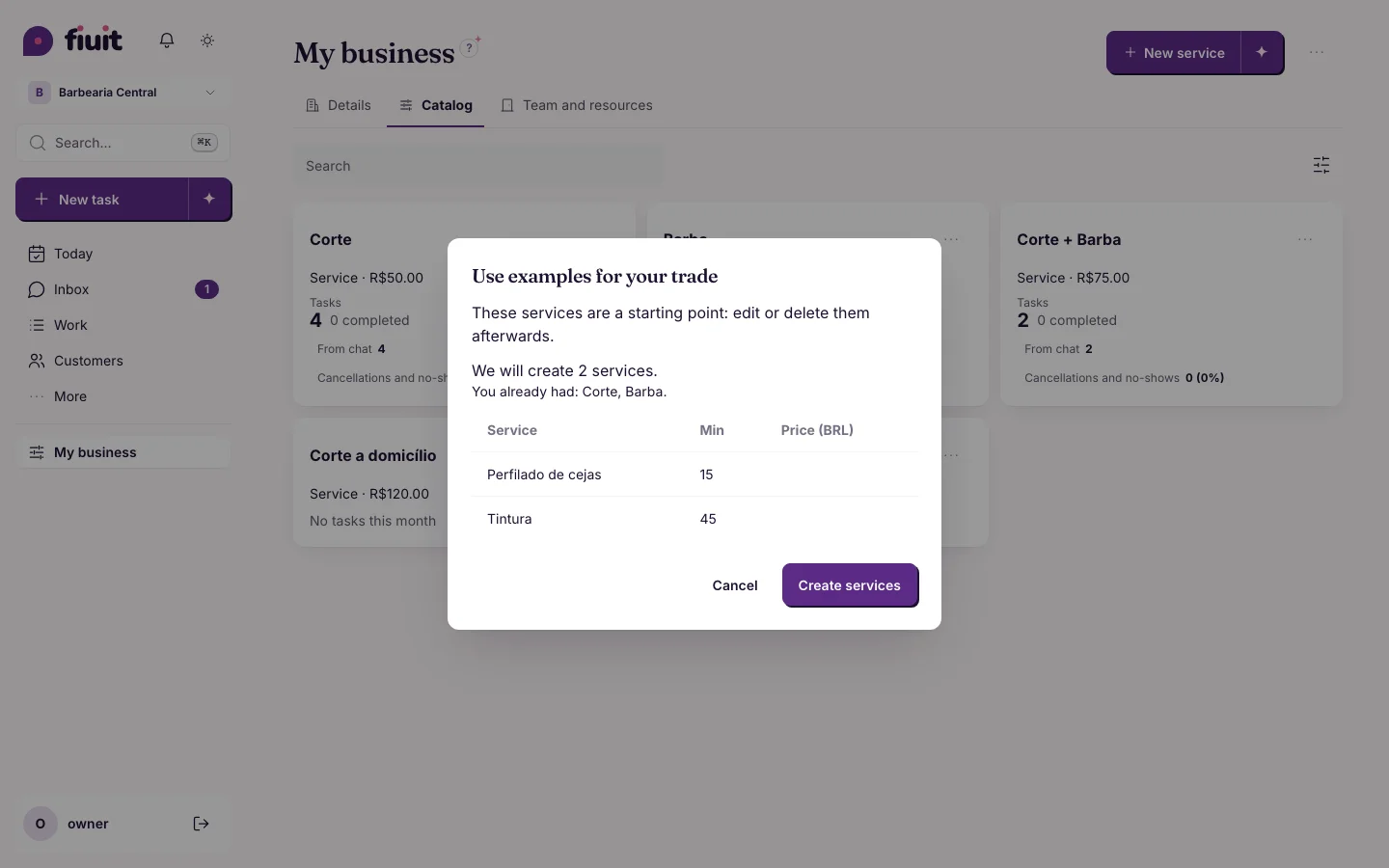
With one tap you create the typical services for your trade, or take a photo of your price list and Fiuit loads them for you to confirm.

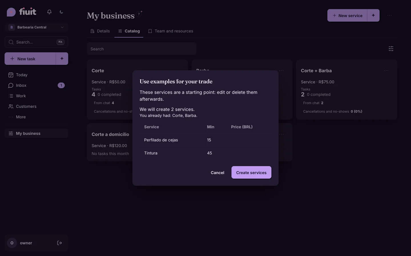
Preview of the example services for the trade, with the «Create services» and «Cancel» buttonsPreview of the example services for the trade, with the «Create services» and «Cancel» buttons

What you get

  • Trade examples: a starter catalog for your business, without prices; edit or delete them afterwards.
  • From a photo: we read name, duration and price from your list and create nothing until you confirm.
  • No risk: what you already have is not repeated and you can undo the load.
Permalink
· 2 changes

History that survives and each customer's rhythm

History stays even when the customer's details are deleted, and you see how often each one comes back.

New

Know how often each customer comes

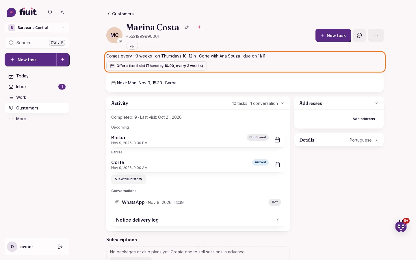
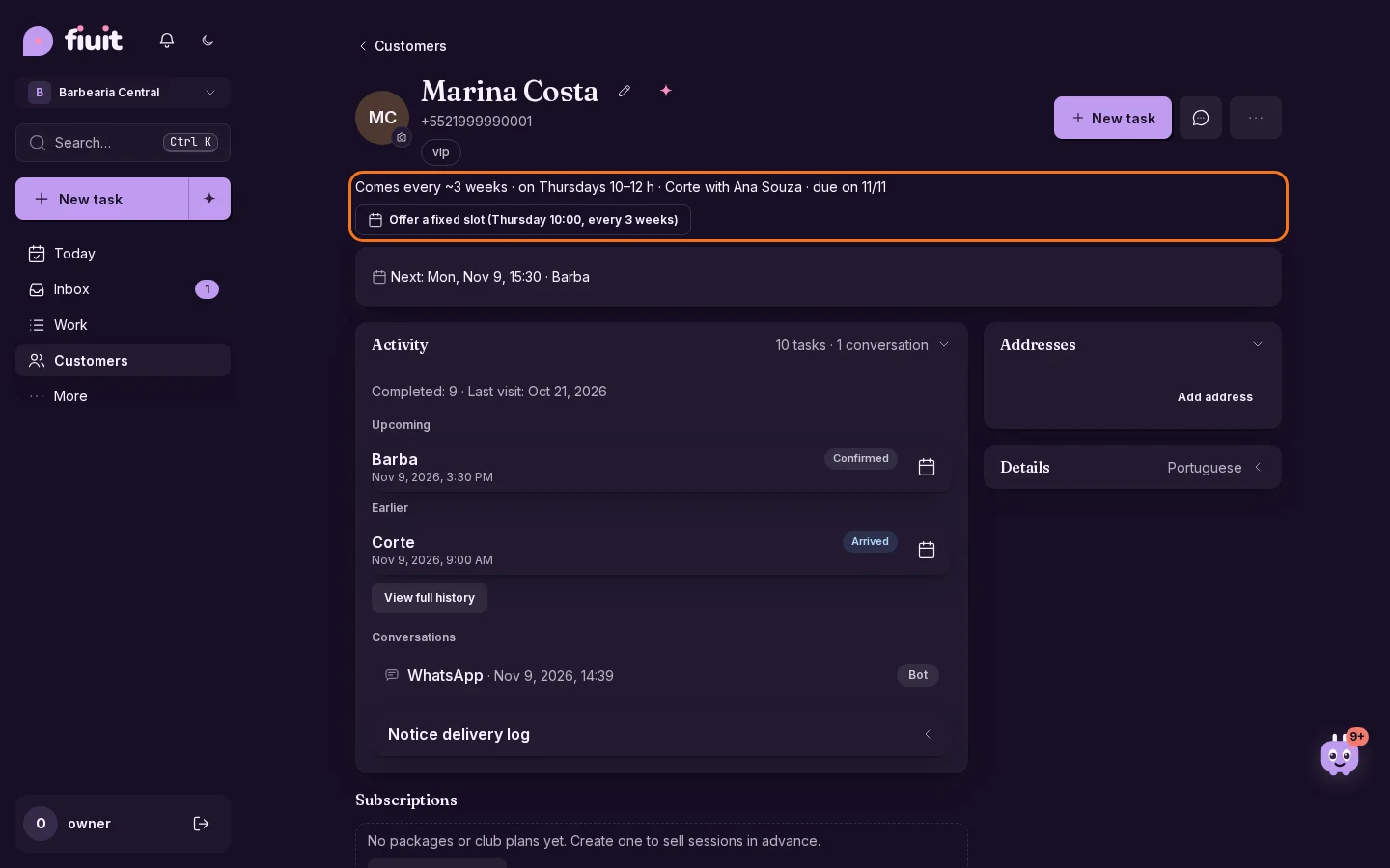
Fiuit learns each customer's rhythm and shows who is due back, who is falling behind and who could use a fixed slot.

Customer profile with the line «Comes every ~3 weeks · on Thursdays 10–12 h», when they are due back and the «Offer a fixed slot» buttonCustomer profile with the line «Comes every ~3 weeks · on Thursdays 10–12 h», when they are due back and the «Offer a fixed slot» button

What you get

  • Each customer's rhythm at a glance: how often they come, their usual day and time, and the service and person they pick.
  • Lost customers by their own rhythm: someone who comes every week shows up within a few weeks, and someone who comes every three months is not flagged too early.
  • Fixed slots for regulars: with one tap you set up their fixed slot, ready to confirm.
  • Ready-made audiences for your messages: «Due», «Late» and «Lost» help you win customers back and write with purpose. New automatic messages come turned off until you turn them on.
Permalink
Improvement

Keep the history when customer details are erased

Tasks keep their history and payments when a customer's personal details are erased.

What you gain

  • Recognize tasks for a customer whose details were erased while keeping a record of the work and the money.
  • Rescheduling the task keeps that identification. Reassigning it to another customer shows the new customer.
Permalink

Week of November 2

· 9 changes

Your result by what you did and the money coming in

See your year month by month, with the result by what you did and not only by what you collected. Record a sale or any income in two taps, the checkbox lists of each stage can be filled in, and nothing waits in silence for a charge.

New

Your results by the work you did, not just by what you collected

See your income statement on an accrual basis or as cash flow: work done in the period counts even before it is paid.

What you get

  • The real result of your work: what you did this week or month counts even if the customer pays later.
  • Pending money in sight: work done and not yet paid shows separately, with a shortcut to collect it.
  • Both views in one tap: switch from accrual to cash flow without losing your filters or the comparison with the previous period.
Permalink
Improvement

Nothing waits silently for a payment

Bookings that end by themselves are closed and what is left to collect stays in sight, by task and by customer.

What you get

  • Your schedule keeps moving: a booking that ends unpaid is closed anyway and the balance stays on the customer account, without holding the slot or being marked late.
  • What is left to collect, in sight: every task with a balance, from today or any date, and who owes how much.
  • No silent waits: if a service requires payment, «Awaiting payment» shows and the team gets a notice.
Permalink
Improvement

Your numbers open instantly

Today, Work and Finance load much faster, even for businesses with thousands of jobs and customers.

What you get

  • No waiting: the home screen, collections and each customer's balance open instantly, even with years of history.
  • Always up to date: every payment, expense or completed task shows up right away, with the same numbers as always.
  • Snappy lists: Work shows pages of 100 tasks with what was collected and what is pending, without delay.
  • Tap and done: moving a stage or completing shows up instantly in Today, Work and Focus; if something fails, the task goes back and we let you know.
Permalink
Improvement

A chat bubble for Inbox and a shorter More menu

Work's icon shows the view you use and «Expand Fiuit» no longer stretches the More menu on your phone.

Bottom bar on mobile: Inbox with a chat bubble and the Work icon of the view in use (on mobile)Bottom bar on mobile: Inbox with a chat bubble and the Work icon of the view in use (on mobile)

Clearer on your phone

  • An icon that reads at a glance: your conversations get a chat bubble that counts what is pending.
  • Your view in one tap: the Work icon tells you whether you are in list, board, map or calendar.
  • Shorter: «Expand Fiuit» has its own screen and no longer stretches the More menu.
Permalink
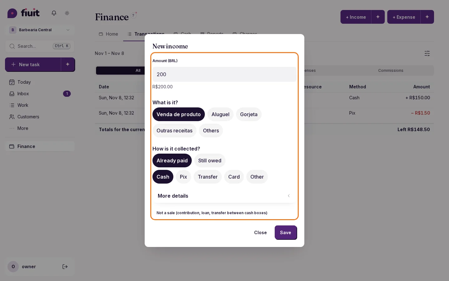
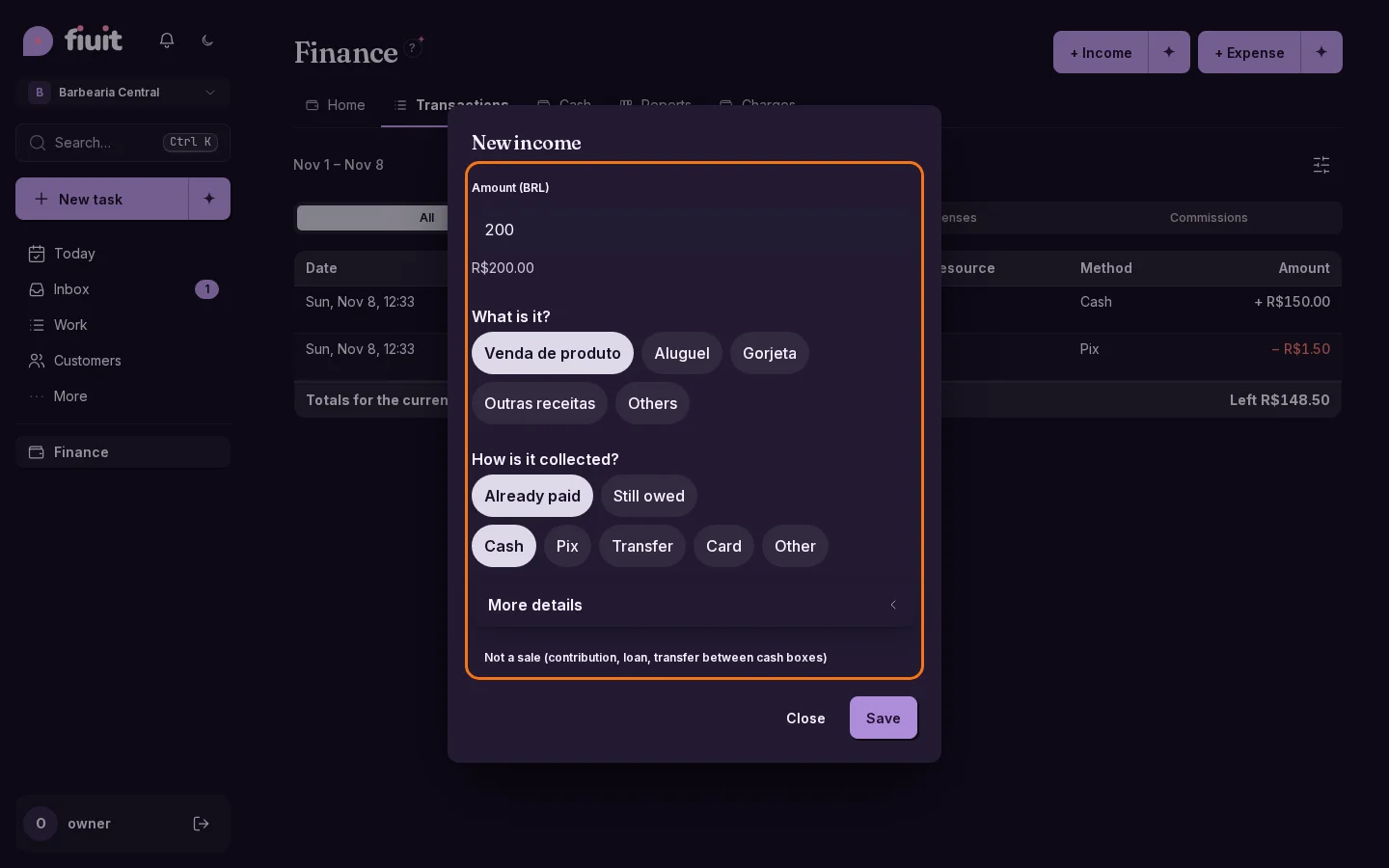
New

Record a sale or any money that comes in, in two taps

Just like you record an expense, now you can log a one-off sale or a payment that never went through your calendar: paid on the spot, with Mercado Pago or to collect later.

«New income» sheet with the amount, «Product sale» selected and the options Already paid, Collect with Mercado Pago and Still owed«New income» sheet with the amount, «Product sale» selected and the options Already paid, Collect with Mercado Pago and Still owed

What you get

  • All the money that comes in, in one place: a product sale, a tip or a rental is recorded even if it never went through your calendar.
  • Get paid on the spot: in cash, transfer, Pix or card, or with a Mercado Pago link or QR that is marked as paid on its own.
  • Nothing slips through: if the customer still owes you, it shows in what you have to collect and in their account.
  • Clear numbers: sales add to your result; a contribution of yours, a loan or a transfer between cash boxes adds to your cash without being mixed up with what you billed.
  • Also by chatting: tell your assistant «charge John 20k for the paddle I sold him» and it gets it ready for you to confirm.
  • Readable when tapped: the selected payment method keeps its contrast on mobile, in both light and dark mode.
Permalink
Fix

Photos you can see clearly

Recognize your customers and team without a camera icon covering their faces.

Recognize each person

  • Customer and team photos stay visible, with a discreet camera on the edge.
  • The photo picker's indicator is also smaller so you can see more of the image.
Permalink
New

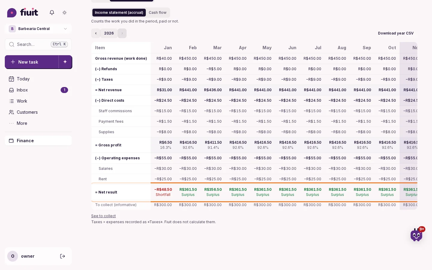
Your year, month by month: what was left and what fell short

See the year's income statement in monthly columns, with taxes, costs and expenses, and at the bottom whether each month ended up or down.

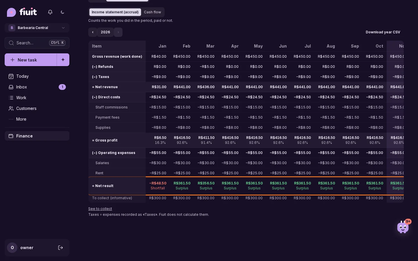
Income statement for the year in monthly columns, with taxes, direct costs, operating expenses and each month's result: Surplus in green, Shortfall in redIncome statement for the year in monthly columns, with taxes, direct costs, operating expenses and each month's result: Surplus in green, Shortfall in red

What you get

  • The whole year at a glance: every month side by side, from revenue to result, in the usual income statement order.
  • Up or down, no math: the last line shows in green or red how each month and the year ended.
  • Taxes where they belong: what you record as taxes comes off before gross profit, apart from everyday expenses.
  • By resource, service or category: with «View by» you see what each court, mechanic or service brought in month by month, or what went out per expense category; what belongs to no one, like rent, stays apart under «General / unassigned», and the rows always add up to the total.
  • Ready for your accountant: the spreadsheet and the accountant package add an «Annual P&L» sheet, and the year also downloads as CSV.
Permalink
· 1 change

A due date only when you need it

The task due date is optional: it shows up only when you need it.

· 18 changes

A checklist per job, branded web chat and a clearer landing

Add a checklist to every job and record an expense by photographing the receipt. Web chat carries your brand, the landing guides you from the first message to the next step, and you know whether the quote reached the customer and what they answered.

Improvement

Your site shows what can be booked, without endless lists

Each service with online booking shows three times per day, the same ones your assistant offers, with the rest one tap away.

What you get

  • No dead ends: the button only appears where your customer can really book.
  • Easier to choose: three times per day instead of a long list, with all the others one tap away.
  • One answer: your site and your assistant offer the same times.
Permalink
Improvement

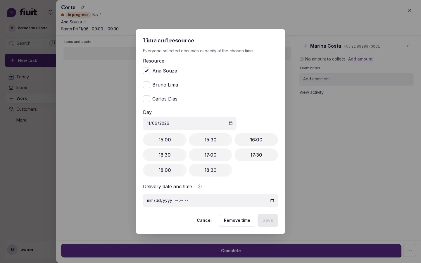
Set the delivery date from the task schedule

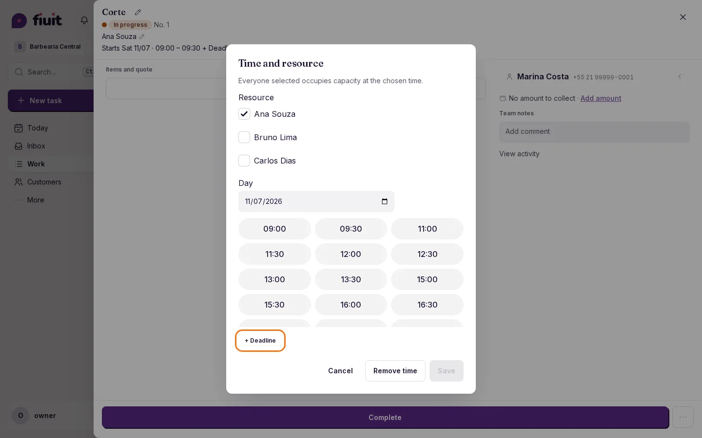
If the service has no delivery lead time, you can now set the date while editing the task schedule.

Task schedule editor with the optional Delivery date and time field

What you get

  • Delivery for any task: it no longer depends on the service having a «Delivery lead time».
  • No schedule changes: if you change only the delivery, the schedule stays put and nobody gets a reschedule notice.
  • No new screens: the field lives in the schedule editor; the header adds nothing for people who don't use it.
Permalink
Improvement

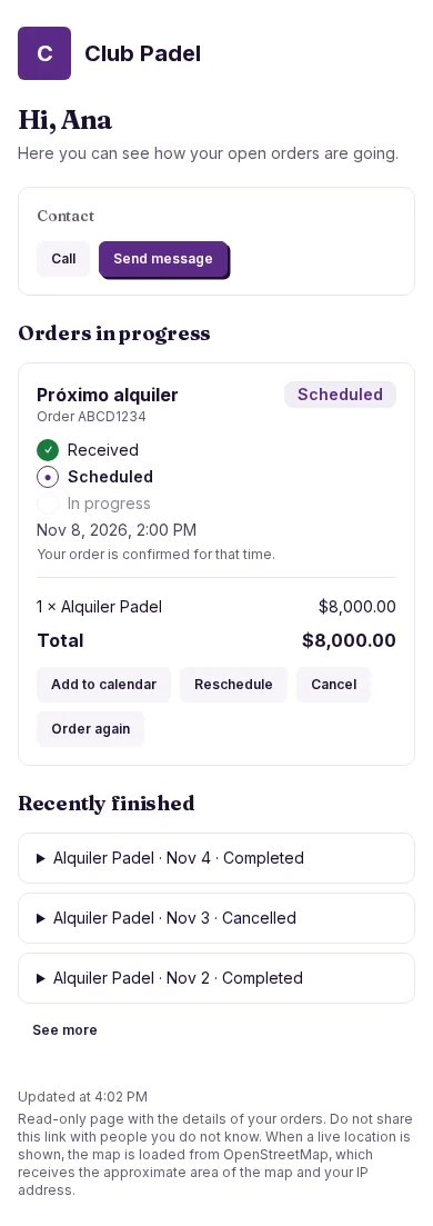
Clearer tracking, compact history

Customers see open orders first and look up previous orders when they need them.

Compact history with three closed orders and an open order visible

What improves

  • Open orders stay in view; closed orders take one row with a date and status.
  • Tap for details and the option to order again.
  • Neutral item headings appear only when services and products are mixed.
Permalink
Improvement

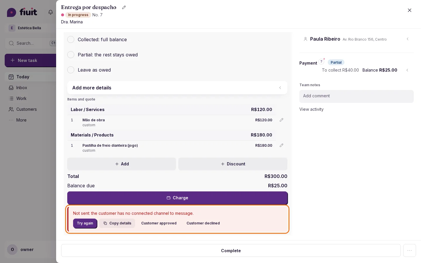
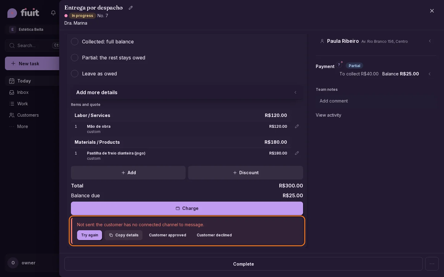
Know whether the quote reached your customer and what they answered

Quotes are really sent, even to customers who never wrote to you, and the task shows whether it arrived, how, and whether it was approved.

Items block with “Not sent” and the reason, with Retry and Copy detailsItems block with “Not sent” and the reason, with Retry and Copy details

What you get

  • Nothing fails silently: if the quote cannot be sent, the task tells you why.
  • New customers too: if they never wrote to you but you have their phone number, the message goes out on WhatsApp.
  • The answer in sight: you instantly see whether the customer approved or declined, with the time and the total.
  • No blocked payments: a quote that did not arrive does not hold what you can charge.
Permalink
Improvement

A clearer home page from the start

The home page shows its message as soon as you open it and lets you request access before the demo.

From the first moment

  • The main message appears as soon as you open the home page and keeps changing with the examples.
  • On mobile, the access request button comes before the demo.
  • The access request makes it clear that email is required and WhatsApp is optional.
Permalink
Fix

Clearer options and error messages

Full-day time slots, selection options and error message buttons display their complete text.

Easier to read

  • Full-day options display the complete start time, including on your phone.
  • Selection options leave space around their text for comfortable reading.
  • Error message buttons move to another row when needed, keeping their complete text visible.
Permalink
New

Record an expense by snapping its receipt

Fiuit reads the ticket or invoice and suggests the amount, date, payee and category; you check it and save.

What you get

  • Less typing: the amount, date and payee come from the receipt.
  • You have the final say: everything can be changed and nothing is saved until you confirm.
  • No surprises: if the receipt can't be read well, the expense is entered by hand as usual.
  • Fewer repeated expenses: if you already recorded an identical one, we warn you.
Permalink
Improvement

Hear when new tasks arrive

Focus whistles on Android and with your device on silent while you work with the screen on.

An alert while you work

  • On Android and on silent too: the whistle alerts you to a new task without looking at the screen.
  • Your choice: turn the bell off to work without sound or vibration.
  • With the screen on: it works with Focus open and depends on device volume.
Permalink
Improvement

More compact Work filters, with several stages at once

Pick more than one stage at a time and see the filter panel as one row per filter, much shorter.

What you get

  • Several stages at once: see the tasks in any of the stages you picked, even from different flows.
  • A shorter panel: one row per filter, and what you do not use stays tucked away.
  • Same layout on your phone: comfortable rows to tap and lists that open inside the sheet.
Permalink
Improvement

You choose the name of what you send your customer

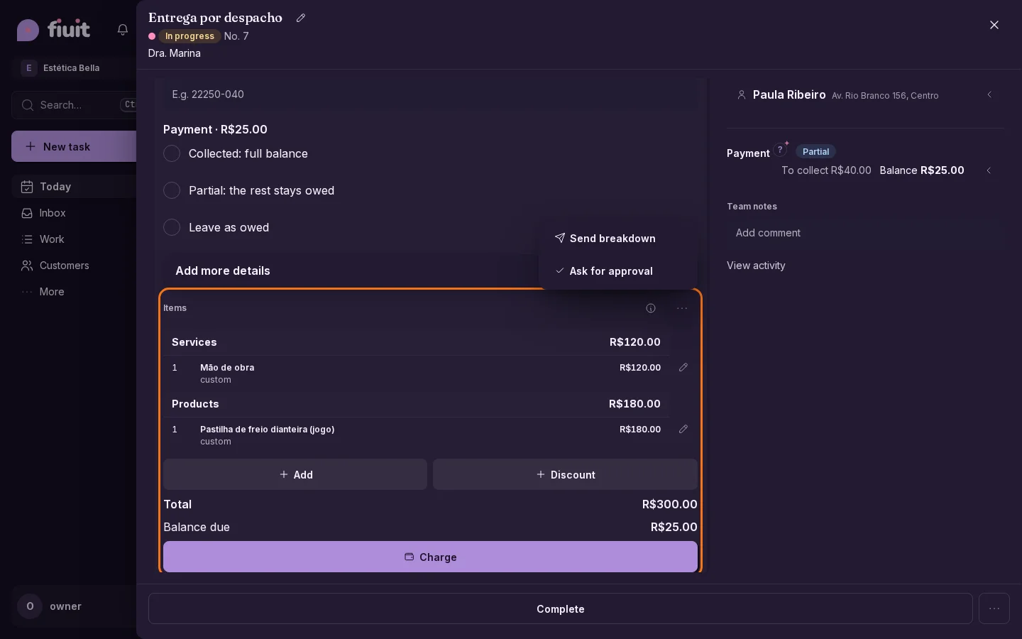
«Breakdown» by default or the word your trade uses, and two clear actions: send the items and total, or ask for approval.

Items block with the menu open: “Send breakdown” and “Ask for approval”Items block with the menu open: “Send breakdown” and “Ask for approval”

What you get

  • Your words: breakdown, quote, work order… whatever your trade uses, in the panel and in messages.
  • Show without holding things up: you send items and total with nothing left waiting and no payments held.
  • Approve when it matters: a stage that asks for approval works just as before.
Permalink
New

A checklist on every job, in seconds

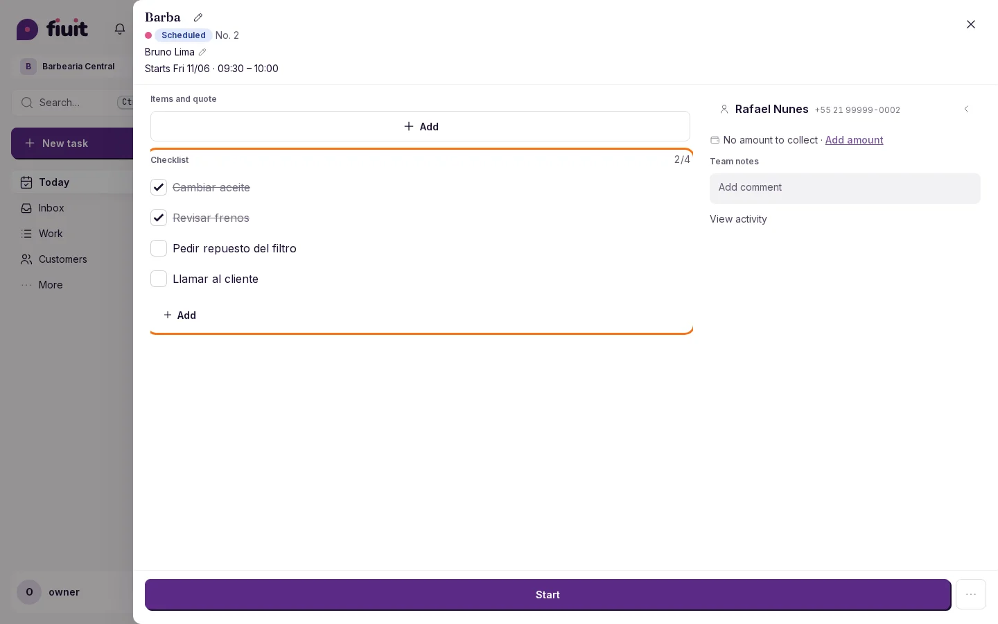
Add the list of what's left to any job, check it off as you go, and never close anything with loose ends without knowing.

Task checklist with 2 of 4 points checked

What you get

  • Nothing slips: every job carries its own list of what's left, built on the spot.
  • Fast on your phone: type, Enter and move on to the next one, no forms.
  • Progress at a glance: see how much is left on each job before opening it.
  • Close with peace of mind: if something is unchecked, you get a heads-up and you decide.
Permalink
FixImprovement

Web chat with your brand, in the right place

New website chats use your business color and logo; the button keeps its position when opened and closed.

What you gain

  • The chat keeps the selected side and, on mobile, returns above the fixed action bar.
  • Your brand appears in new chats, with readable text even on light colors.
Permalink
Fix

Rescheduling and payments work in administrative health scheduling

Projects with administrative health scheduling offer free times again when rescheduling, and what is hidden for privacy is explained in one line, without an error.

Rescheduling and payments in administrative health scheduling

  • Free times again: the schedule editor computes them from the task's service without showing it.
  • No red alerts for privacy: what health mode hides is explained in one line.
  • Visible mode: the panel shows when administrative health scheduling is active.
  • Tasks without a service: flow tasks allow editing start and end times without looking up free slots.
Permalink
· 22 changes

Choose and pay your plan, health bookings and sites with your photos

Choose and pay your plan from the panel, and canceling really stops the charge. Health appointments use neutral notices, your forms keep the order you chose, and your public site adds your business photos, with three new designs.

Improvement

Three new websites for your business

Your website gets three new designs: Oficina, Confiança and Spec sheet. Pick one, add your color and it looks right on phones and computers.
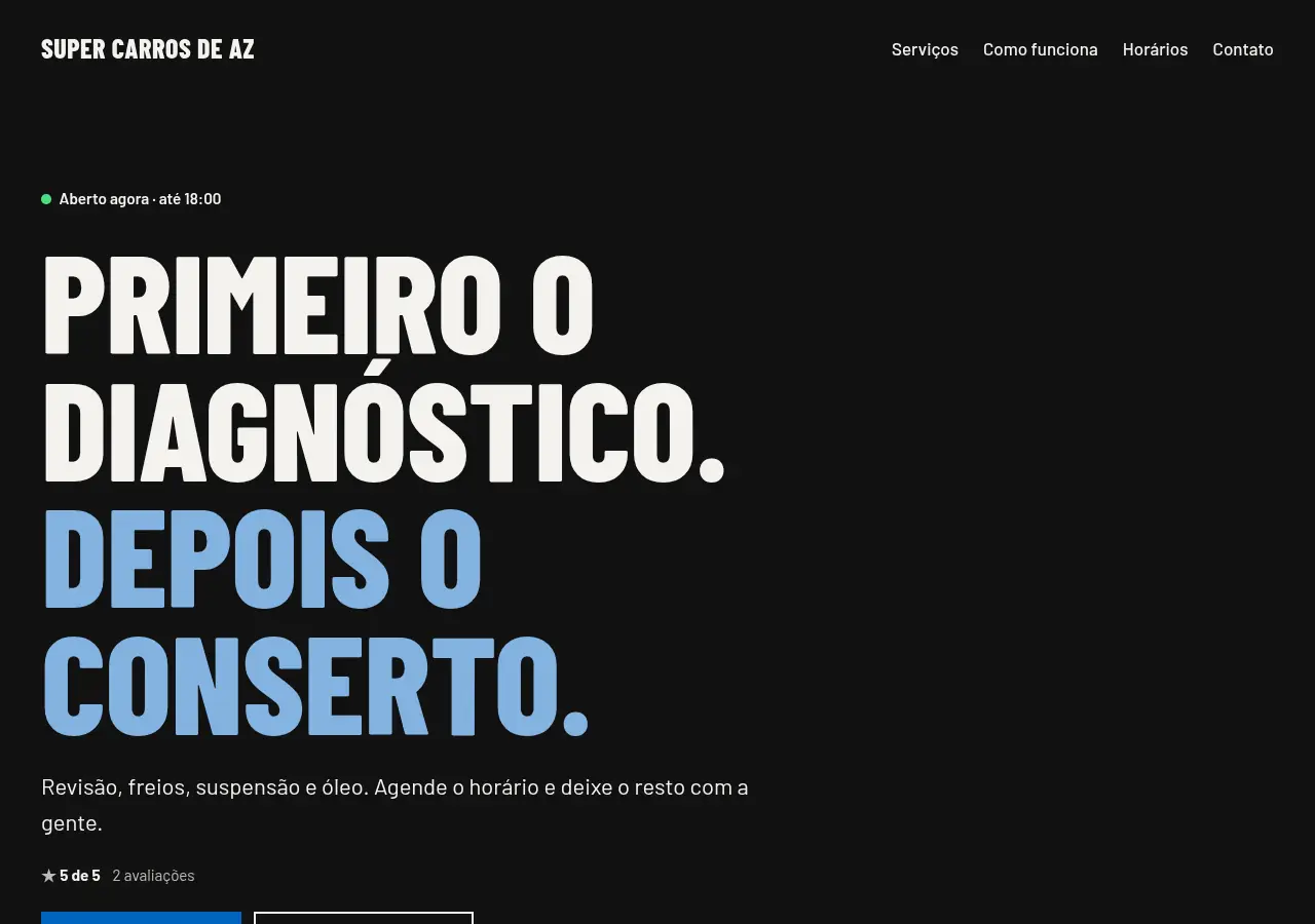
Oficina: dark, with a huge headline

What you get

  • Polished designs: each option pairs a font and a shape, with no details to decide.
  • Your color, your business: texts, services and hours come from what you already entered.
  • Always tidy: a spot without a photo shows a soft background. You can add your photos whenever you want.
  • Your services in groups: in Oficina and Confiança, name them «Group: service» and they show in columns.
Permalink
New

Your website, with your business photos

Show your space and your work with your own photos in any of your website's three designs.

What you get

  • Your business on display: add your own cover, space and work photos.
  • Always tidy: photos stay when you change designs; empty photo slots use a soft background, with no broken images.
Permalink
Improvement

Your public website, clearer from the hero

Your website's hero uses your contact channels, looks tidy even before you add photos and shows only what helps your customers.

A website that invites customers to reach you

  • Contact from the hero: book, order or use your published WhatsApp, phone, Telegram or Instagram. Without a valid destination, no unusable button appears.
  • Tidy even without photos: the hero shows your name and what you offer, with no empty boxes.
  • Only what helps your customers: internal spaces assigned by your schedule aren't published; the courts or rooms customers pick when booking stay visible.
  • No repeated prices: if all your services are on request, the site says so only once.
  • Better aligned: titles and sections keep the same margins on mobile and desktop.
Permalink
New

Wagy suggests features when they help, without nagging

When your business starts needing something more, Wagy suggests it once, with a real figure, and stays quiet if it is not useful.

What you get

  • Just enough, when needed: features show up when your business starts using them, not all at once.
  • With a real figure: each suggestion says why it appears and what will change.
  • No nagging: at most two a week, and if you say it is not useful it never comes back.
Permalink
Fix

Wagy replies in the language you write in

If you ask something in Spanish with the panel in Portuguese, Wagy answers in Spanish, including its fixed and error messages.

Wagy replies in the language you write in

  • If you ask something in Spanish with the panel in Portuguese, Wagy answers in Spanish, including its fixed and error messages.
  • If it can't answer a question, it says so instead of offering to set something up.
  • It explains panel numbers with the real data; if it can't verify them, it says so.
Permalink
New

Several photos in the same work step

A work step can ask for several photos, as many as you choose: before, after or each damage, together in one place.
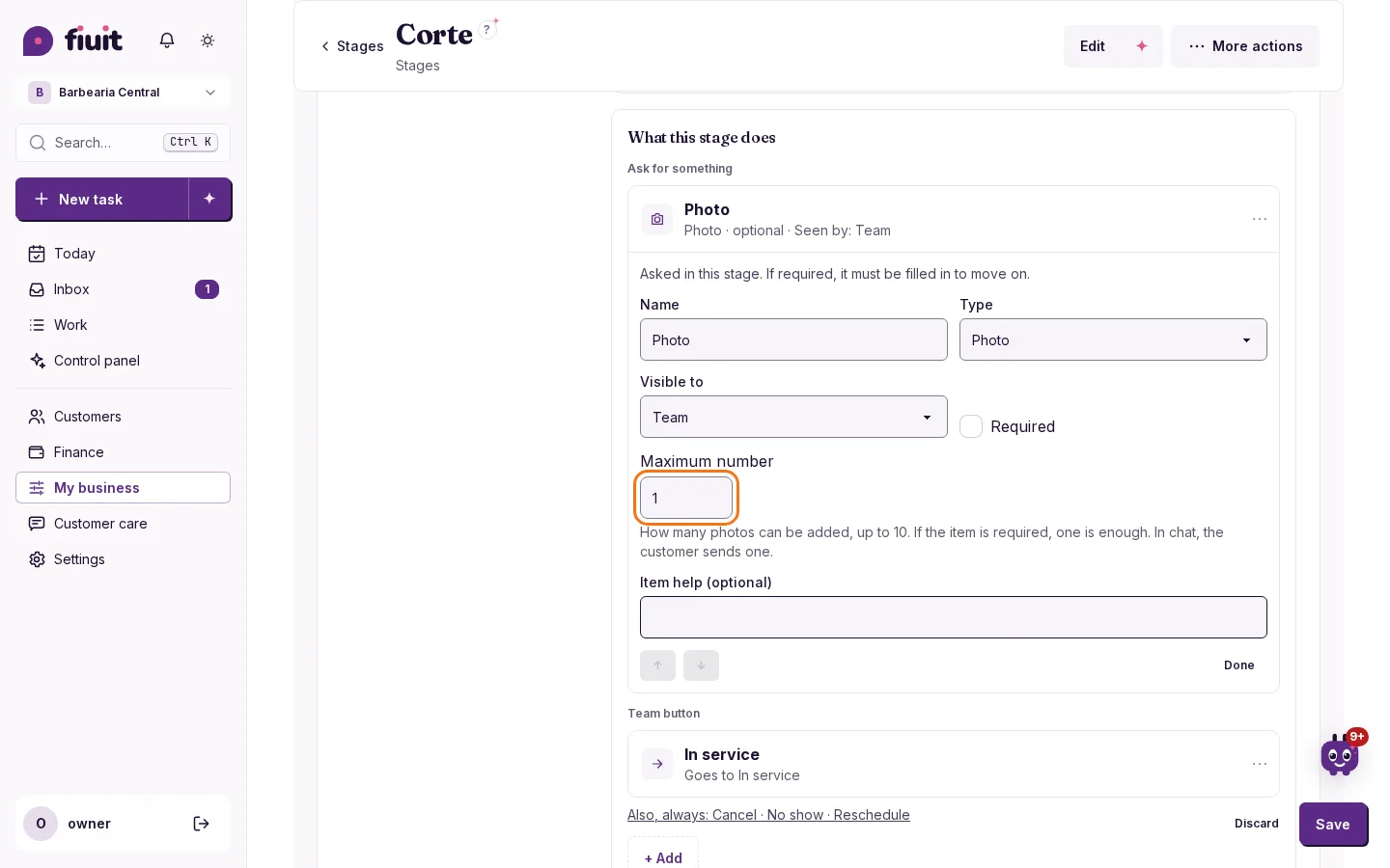
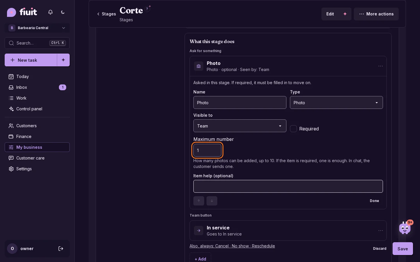
Stage Photo item with the Maximum number field.Stage Photo item with the Maximum number field.

More photos, less back and forth

  • You choose the number: up to 10 photos in the same step.
  • What you have stays the same: if you change nothing, one photo is asked for.
  • Required without asking too much: one photo is enough to move on.
  • No surprises: if the task reaches its file limit, it tells you clearly.
Permalink
Improvement

A clearer panel, the same for your whole team

Rounded cards, fewer lines and icon-only actions: the panel looks the same on every device, with nothing to turn on.
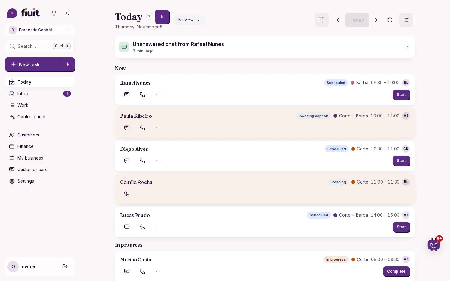
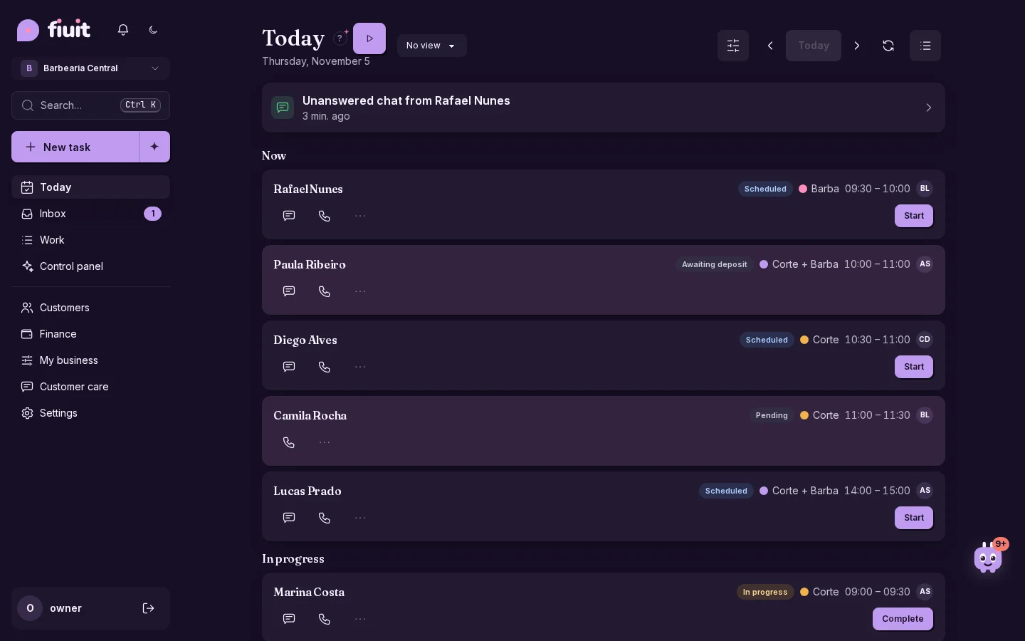
Today with rounded cards on the light gray background and icon-only buttonsToday with rounded cards on the light gray background and icon-only buttons

Clearer and consistent

  • The same everywhere: one panel on phone, tablet and computer, for your whole team.
  • Easier to read: rounded cards, with the status next to the name and one line less per task.
  • Nothing to set up: it's ready when you log in.
Permalink
Improvement

Clearer who picks the products and who adds the items

The intake form and “How the task looks” now say who uses each block, with expandable help on when it helps and how it relates to the bot.

What gets clearer

  • Who uses each block, without opening anything: the form's products block title says your customer picks when ordering; the items one, that your team adds them in the task.
  • Expandable help: what each is for (with an example), when you don't need it and how it relates to “What the bot sells”, with a direct link.
  • The bot, without surprises: the help explains that a service with the “Products” field counts as “Orders” in “What the bot sells”, and that the items switch doesn't change what the bot offers.
Permalink
Improvement

Your next step to move up a league

See what you need to advance as a partner when you sign in, and open your courses or create a project from the same card.

Keep moving forward

  • Find your league first and distinguish courses from paying clients; trial clients do not count toward promotion.
  • Open C1 if you have not passed it yet, or return to your courses to keep learning.
Permalink
Improvement

Partner leagues: courses and customers

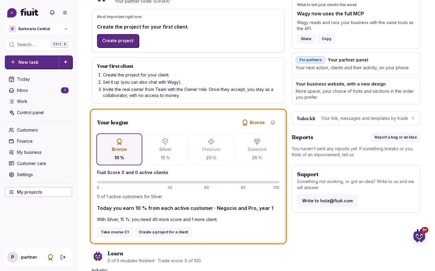
Move up with courses and paying customers. If you stop meeting the requirements, you have 6 months to recover and what you already sold keeps its rate.

What you get

  • Clear rules: each league asks for courses and paying customers, without relying on a score.
  • Your work is protected: if you stop meeting the requirements, you keep your league for at least 6 months and what you already sold keeps its rate.
Permalink
Improvement

The control panel counts what is really left today

The day's pending work matches what you see in Today, including work that started on another day and is still in progress.

A number you can trust

  • What is left, no surprises: the day's pending work is the open tasks you see in your today list, including long jobs that started on another day.
  • In your words: the panel names the work the way your business does, and the team shows only people.
Permalink
Improvement

Clearer names for supporting your clients

The partner panel makes your clients and the local implementer training easier to identify.

What you gain

  • Clients are easier to find: your panel name reflects the businesses you support.
  • A clearer training name: local implementer training better describes your work in the area.
Permalink
Improvement

A simpler menu and “Expand Fiuit”

The menu starts with Today, Work and Clients. Everything else is under More, with a search by outcome.

Less on screen, everything at hand

  • Short starting menu: Today, Inbox, Work and Clients, plus More.
  • Expand Fiuit: capabilities by outcome, with what each needs, an example and search.
  • Advanced: Developers, Webhooks, Status and Copy configuration.
  • Stages are reached from More › Expand Fiuit.
  • Pin what you use: in More, “Pin to menu” keeps the section in the sidebar.
Permalink
Improvement

Clearer tasks at a glance

Actions stay visible on the computer, and long stages leave the date and balance readable.

Easier to read and use

  • Actions stay visible and each stage respects its column. Directions accompany deliveries and visits; services at the business do not offer them.
Permalink
Improvement

Cancelling really stops the charges

When you cancel your plan, the Mercado Pago debit is cancelled by itself and you are not charged again.

What you get

  • No surprises: once you cancel there are no more charges, without writing to anyone.
  • What you paid is respected: you keep your plan until the end of what you already paid.
  • Clarity: we only tell you it is cancelled once the charge is truly cancelled.
Permalink
Improvement

Filter your work by flow and by stage

Find what is at each part of your process with one filter, even if your business runs several journeys.
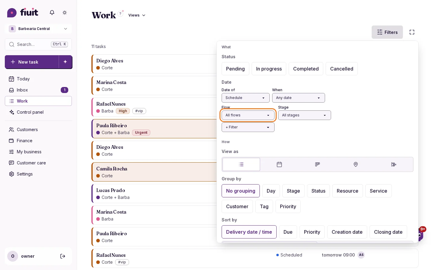
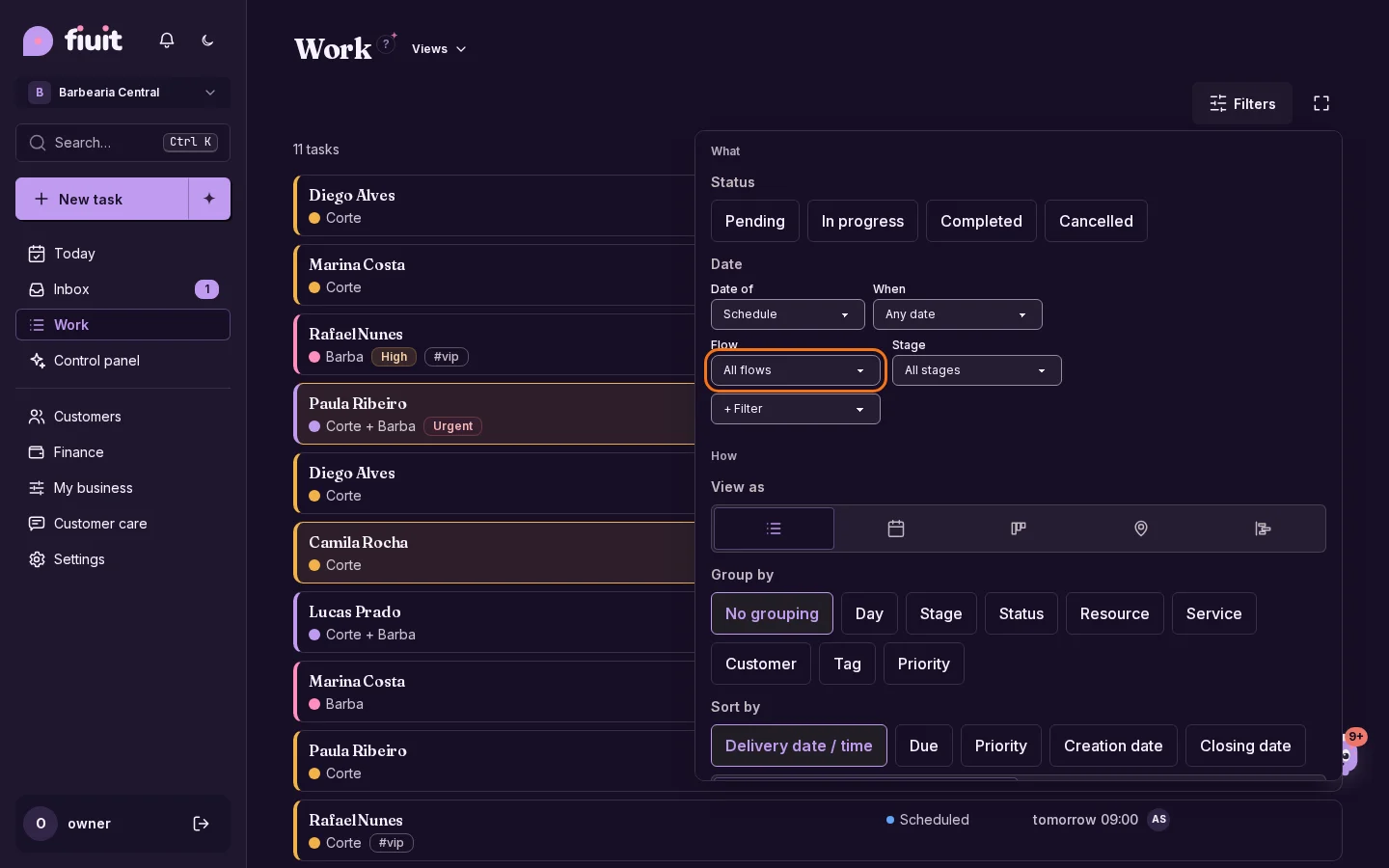
Work filters with the Flow and Stage selectors in plain sightWork filters with the Flow and Stage selectors in plain sight

What you get

  • Focus on your process: see a single journey, or only what is at one of its stages.
  • Nothing to set up: if you work with one flow, you see no extra options.
  • Yours, at hand: save the filter in a view and open it whenever you want.
Permalink
New

Your bot learns from what customers ask

When several customers ask the same thing and your bot didn't know, it tells you with an answer ready to approve.
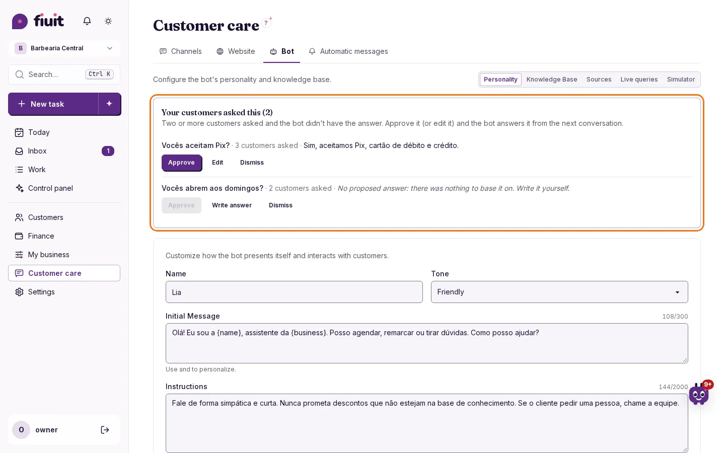
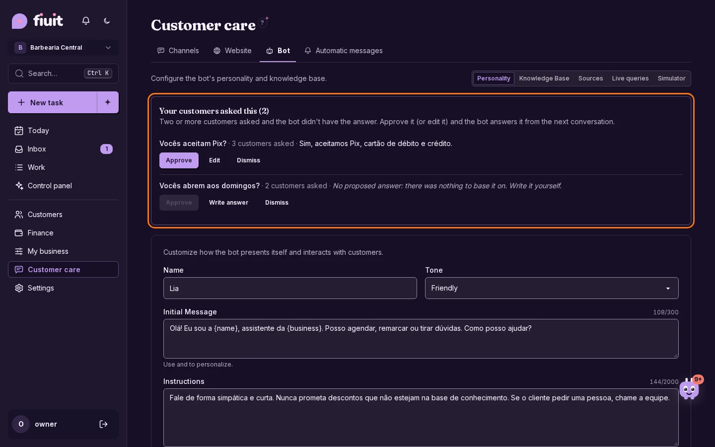
Customer questions to answer — Customer care → BotCustomer questions to answer — Customer care → Bot

Your bot learns from what customers ask

  • What they ask most, in plain sight: when two customers ask the same question, even worded differently or in another language, we show it to you.
  • With the answer almost ready: we draft it from what your business already knows or what your team replied. If there is nothing to base it on, we ask you without making anything up.
  • You decide: nothing is published without your approval, and what you dismiss won't show up again.
Permalink
New

Your team works without seeing prices or billing

Decide whether your team sees the amounts of their jobs: they log what they used without seeing prices, and you fill them in before sending the quote.
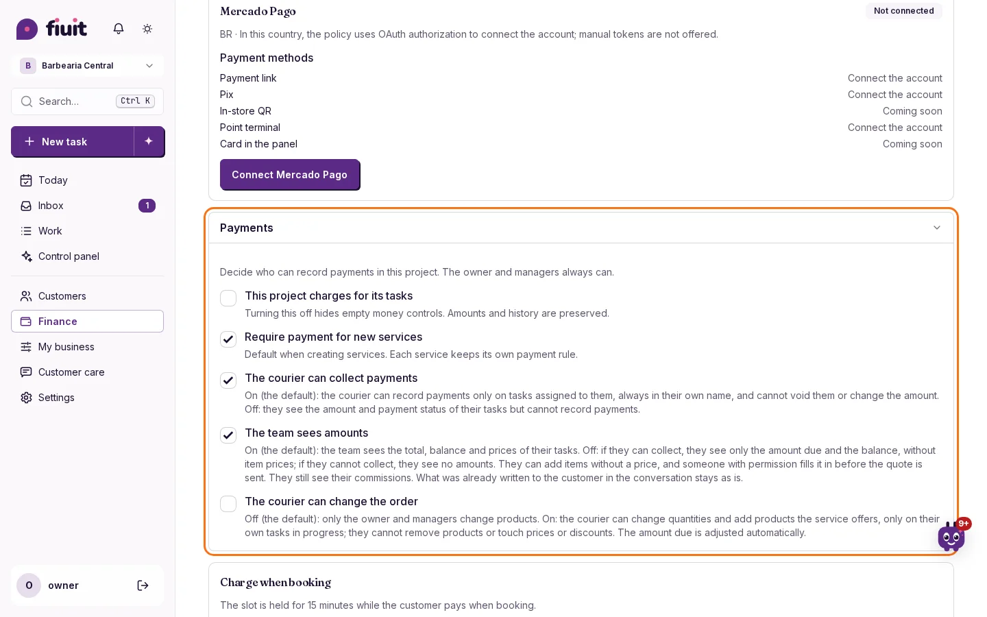
Finance → Payments with the «The team sees amounts» switch below «The courier can collect»Finance → Payments with the «The team sees amounts» switch below «The courier can collect»

What you get

  • Everyone sees their part: your mechanics or technicians work with the full task, without prices or balances if they don't need them.
  • Nothing stalls: they log what they used, from the catalog or typed in, and you set the price before sending the quote.
  • Commissions in sight: each person still sees what they earn.
Permalink
New

Choose and pay for your plan from the panel

You choose your Fiuit plan and pay with Mercado Pago in a minute, without writing to anyone.

What you get

  • No waiting: choose and pay whenever you want, without asking anyone for a link.
  • No interruptions: once the payment clears, everything works again by itself.
  • No surprises: you see the price in your currency before authorizing and can cancel anytime.
Permalink
New

From photo to form in one tap

Your team takes a photo of the dashboard or the license plate and Fiuit suggests the details it can read. They check and confirm.
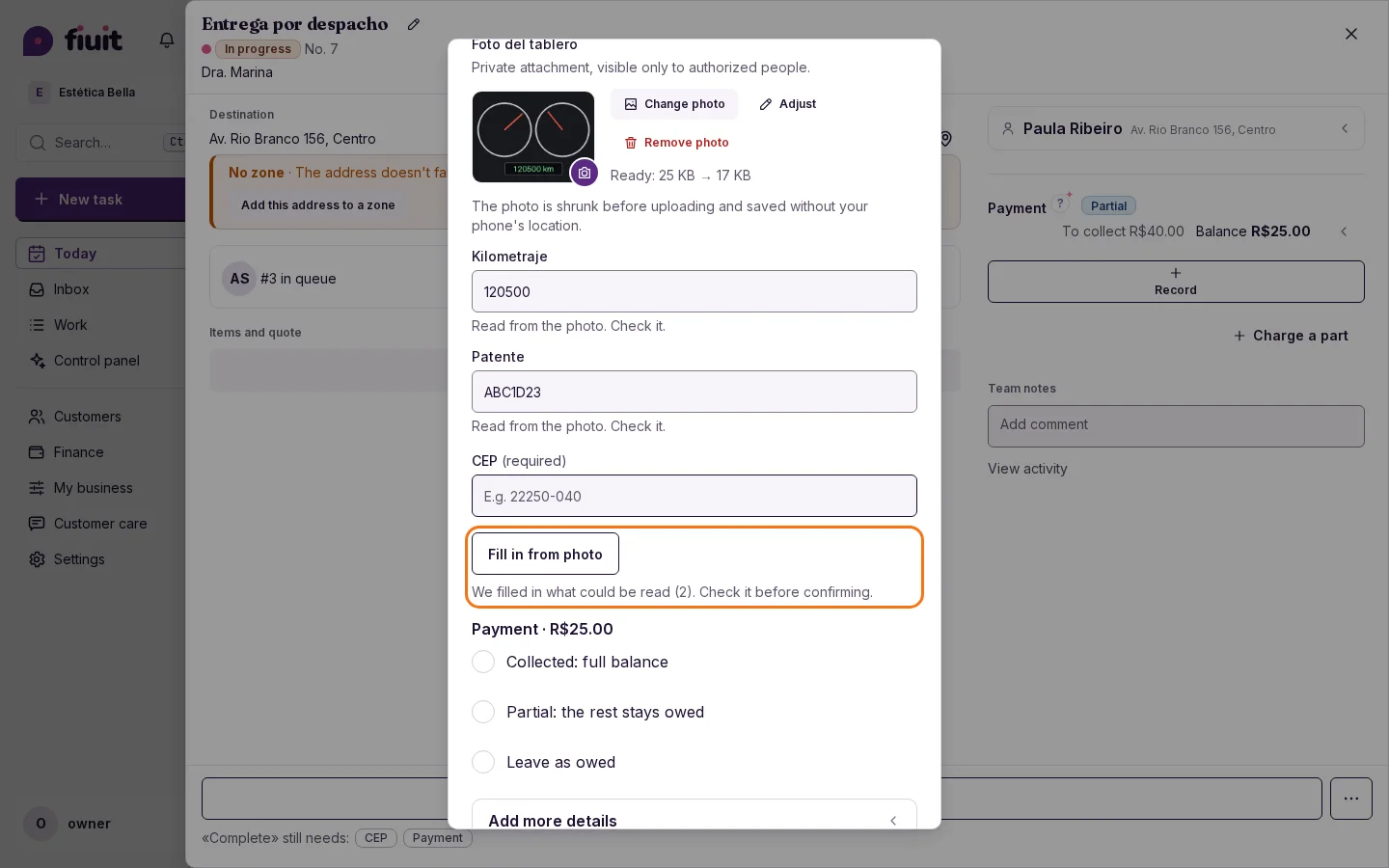
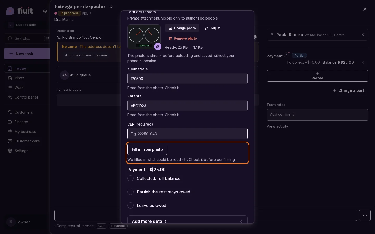
Stage form with a dashboard photo, and mileage and license plate filled in and marked «Read from the photo».Stage form with a dashboard photo, and mileage and license plate filled in and marked «Read from the photo».

Less typing on every job

  • Fewer copy mistakes: mileage, license plate or serial number come from the photo, not from memory.
  • Always reviewed: what can't be read with certainty stays empty, and nothing is saved until the person confirms.
  • Nothing to set up: it appears on its own when there is a photo and details to fill in.
Permalink
Fix

Your forms, in the order you chose

Each detail is requested in the same order you set in your flow, so your team fills it in faster, without jumping between fields.

What you get

  • Fewer mistakes: your team follows the order you planned for each task.
  • No jumping around: required and optional details each appear in their place.
Permalink
Improvement

Neutral appointment notices for health practices

Notices name the professional and appointment time. The chat reminds people about privacy and continues with scheduling.

What is included

  • Reminders only name the professional and appointment time, without reasons or specialties.
  • External calendars also receive neutrally named events; refreshing keeps their time and status.

Scope

  • The schedule is administrative. The privacy warning does not remove content already received.
Permalink
· 12 changes

Discounts, cars on tasks and an essential Focus

Give discounts on your jobs with a record of how much and why, and keep your customers' cars on every order. Focus shows the essentials, multi-day jobs stay in Today, and optional stage items show up when you complete it.

New

Keep pending work close

Check open tasks, overdue work and conversations awaiting the team in one place.

Keep pending work close

  • Check open tasks, overdue work and conversations awaiting the team in one place.
  • See what needs attention and open the matching list with one tap.
Permalink
New

Special plan price for one customer

Offer «first month at 50%» or a lasting price to one customer, without creating another plan.

What you get

  • One plan: the discount belongs to that customer: the plan stays the same for everyone else.
  • No surprises: you see what each installment charges before confirming, and issued ones don't change.
  • No math: when the discounted installments end, it returns to the plan price on its own.
Permalink
Improvement

Your league, score and commission

The first five courses are published. See your league and the rate that applies as you grow with your customers.

Your Bronze league: score 0, 0 active customers and 10 % commissionYour Bronze league: score 0, 0 active customers and 10 % commission

Your league, score and commission

  • Learn with the first five modules and their quizzes. Your league combines score, active customers and commission rate in one ladder. Rates halve every 12 months, with a 3 % care floor and program caps; regional leader is by invitation and agreement.
Permalink
Fix

Optional stage items now show when you complete the stage

Whoever completes a stage sees its optional items, such as «Mark on image», and can fill them in without making them required.

Optional, in plain sight

  • Visible without being required: the item shows in the stage and whoever completes it decides.
  • Required really means required: if no path of the stage asked for it, it is now asked when moving on. A newly created task shows it too.
  • Moving on is still one tap: nothing stops you if you leave it empty.
  • On the worker link: what can be typed is asked there; photos, signatures and marks are filled in from the panel.
Permalink
Improvement

Upload your image and always mark on the same one

«Mark on image» can now open with your business image, for example a sketch of a car: whoever completes the stage only draws on top.

Always on your image

  • Your image, just once: upload it when you build the stage and it works for every task.
  • Nothing to attach: whoever does the work opens the canvas and marks.
  • Optional: if you upload no image, one is attached at that moment.
Permalink
Improvement

Your multi-day jobs, always in Today

Work that came in days ago and is delivered later shows up in Today every day, and the screen remembers how you left it.

What you get

  • Nothing gets lost: a long job stays in sight every day until delivery.
  • Nothing to set up: the screen remembers your filters on its own, on all your devices.
  • Fewer taps on the phone: the view and filters in one row.
Permalink
Improvement

Focus, with the essentials in view

Your team sees only the current stage, knows what each swipe will do and comments without leaving the task.

Less noise, more work done

  • Only the essentials: each card shows the current stage and nothing else.
  • Clear gestures: before you let go, you already know what will happen to the task.
  • Comments at hand: the team shares internal notes without leaving the task.
Permalink
Improvement

Focus list: customer, asset and stage at a glance

On mobile, Focus shows a compact row with the customer and their asset. On wider screens, cards keep their actions and show the short destination.

Focus in List: customer, asset, time, service, stage and short destinationFocus in List: customer, asset, time, service, stage and short destination

Reads at a glance

  • Nothing to set up: the list already works this way.
  • What matters first: the customer and their asset; empty things are hidden.
  • Short address: one line, only when there is a destination.
Permalink
New

Give discounts on your jobs, with a record of how much and why

Apply a discount as an amount or percentage to any job: your customer sees it clearly and your numbers show how much you discounted.

What you get

  • No price changes: discount a single job and your price list stays the same.
  • Clear for your customer: they see the discount on the quote, the payment link and the tracking page; the reason stays with your team.
  • Numbers in view: the analysis report shows how much you discounted, and income is still what you collected.
Permalink
Improvement

The bot notes the car on every request

When a customer writes to you, the task arrives with their car, with no extra questions and no setup.

The car, from the first chat

  • No extra questions: if it already knows the customer's car, it uses it and shows it before confirming.
  • No duplicates: the same plate is the same car.
  • To each their own: the bot never shows another customer's cars.
  • Nothing to set up: if your business does not keep vehicles, the bot asks nothing new.
Permalink
· 6 changes

A tidier task page and a simulator with versions

The task page is tidier, reception keeps the car up to date and you can attach an image and mark the damage on it. The bot simulator shows which version replied and what it knows, and one order can have several services with their own price.

Improvement

One order for several services, each with its own price

The products a customer picks when booking can now be shared across several services: each one charges by its own price.

One order, several services

  • No repeated flows: services that share a path also share the list of products the customer picks.
  • Each service with its price: one can charge only the products, another add a fixed charge and another charge a set amount.
  • Safe amounts: Fiuit calculates the total with your catalog prices, never by hand.
Permalink
New

Attach an image and mark on it where the damage is

New «Mark on image» field: whoever completes the stage attaches an image, draws on it with a finger and it is saved as one image on the task.

Task with an attached image and two red marks drawn on it

Mark on a photo, no fuss

  • An image and a finger: attach the photo and draw on it in red.
  • Undo and Clear: fix one stroke or start over.
  • One image: when you lift your finger it is saved in the task attachments, like the signature.
  • No setup: add it to the stage and that's it.
Permalink
Improvement

Your day opens the way you left it, on your phone and your computer

Today remembers the view you picked and opens it the same way on all your devices. And it filters your day with the same filters as your work.

Your day, always at hand

  • Follows you everywhere: the view you pick opens the same on your phone and your computer.
  • Everyone's own: each person keeps their preferred view; the owner can pin one for the whole team.
  • The same filters as your work: filter the day by status, assignee, priority or late, with nothing new to learn.
  • Nothing to set up: it works from day one.
Permalink
Improvement

A tidier task card

Dates sit on one line, the title is edited with a pencil and team notes live in a single section.

A card you read at a glance

  • Dates on one line: «Starts Thu 12 · 09:00 · Ready by Sat 14».
  • One notes section: the pinned note on top and the team comments below.
  • Secondary things collapsed: activity and task details.
Permalink
New

Check-in keeps the car up to date

In a repair shop, the team sees the car's details already filled in at check-in and only types the mileage: the customer's car stays up to date and each visit keeps how it arrived.
Check-in stage with «Vehicle details»: the car's plate, model and mileage already filled inCheck-in stage with «Vehicle details»: the car's plate, model and mileage already filled in

The car up to date on every visit

  • Nothing to set up: a repair shop created from the template already has «Vehicle details» at check-in; if your business doesn't keep vehicles, you see nothing new.
  • You type only what changed: the car's details come filled in; at check-in the mileage is enough.
  • Each visit keeps its own: the task keeps how the car arrived that day and the customer keeps the newest details.
  • Clear titles: each task can be titled with the car's model and plate, for example «Gol · AB123CD».
Permalink
· 6 changes

One main button and the business profile

Every task tells you what to do now with a single main button, and the business profile gathers your logo, name and palette. Your customers' cars stay on their page and every booking knows which car it's for.

New

Your customers' cars, saved in their profile

If you run a repair shop or a car wash, each customer keeps their vehicles with plate, model, year, mileage and color, with no setup.

Every car, with its owner

  • No setup: repair shops and car washes start with Vehicles ready; other businesses see nothing new.
  • Just the essentials: the plate or the model is enough; fill in the year, mileage and color whenever you want.
  • Organized: the usual car stays as the default and the one that no longer comes is archived without losing anything.
Permalink
Improvement

Every task tells you what to do now: one main button

Each job highlights a single button: the next step, or «Charge» when it is time to get paid.

What you get

  • No second-guessing: each job highlights one button, the next step.
  • Get paid at the right time: when it is time to charge, «Charge» moves to the front on its own.
  • Nothing to set up: each service's flow decides.
Permalink
New

Every booking knows which car it is for

At a garage or a car wash, each booking is linked to the customer's vehicle, and every car's history shows all its visits.

New task with the customer's vehicle: the default one picked and the option to type anotherNew task with the customer's vehicle: the default one picked and the option to type another

From the car to the task, no detours

  • Nothing to set up: if your business does not keep vehicles you see nothing new; at a garage or car wash it already works.
  • One field: you type the model or the plate and the car is saved in the customer's profile.
  • A history for each car: every visit keeps how the vehicle was that day, for example its km.
  • Online and with Wagy too: your customers can enter their car when they book online, and Wagy notes it when scheduling.
Permalink
Improvement

Business profile with your logo, your name and your palette

Your business, profile-style: the logo as an avatar, the name up front, the palette as a chip and the setup score, all in one place.

A profile you understand at a glance

  • Your brand first: the logo as an avatar, the name and the palette in a single card.
  • Smaller palettes: a three-color swatch per option; the preview shows on hover.
  • Your progress in sight: the setup score tells you what is missing and takes you to complete it.
Permalink
Improvement

WhatsApp templates move into Channels, and «Channels» goes back to the list

WhatsApp templates are no longer a Customer care tab: they live inside Channels › Official WhatsApp, and every channel detail gets a back arrow.

Everything about official WhatsApp in one place

  • No separate tab: the templates Meta approves sit next to the channel connection.
  • Only when needed: with no official channel connected, nothing shows.
  • Go back without getting lost: on the WhatsApp, Instagram, Telegram, site chat and form details, «‹ Channels» is a button that returns to the list.
Permalink
Improvement

Work list: a compact row that always shows the name

Each task shows the full name, stage, short date, assignee and what is still owed, in a row you can read at a glance.

Compact Work row — Work → task listCompact Work row — Work → task list

Every task reads at a glance

  • The name always shows: the customer is no longer cut off by the other columns.
  • Stage, date and assignee: a dot with the stage name, the short date (“Sat 10/31”, “today 14:00”) and the avatar of whoever has it.
  • What's left to collect: the pending amount, on the right.
  • Late: the date turns red and the second line says by how much.
Permalink

Week of October 26

· 12 changes

Charge each job its own price and choose how your site looks

Charge each job its own price without touching your catalog, with the delivery date and items inside the stage you choose. On desktop the task shows in two columns, there's a quick view in the calendar, map and lists, and you choose how your site looks.

New

Choose how your website looks

Your public website can use six different styles: pick the one that suits your business best and change it any time.

What you get

  • Your website, your way: Classic, Dark, Color, Pulse, Match or Garage, with your colors, logo and photos.
  • No surprises: you see how it looks before saving and can change it any time.
  • Nothing to set up: if you don't pick, your website keeps the style for your type of business.
Permalink
Improvement

Wagy fixes your setup in plain words

From what's missing in your setup, Wagy proposes the concrete change using your services' names, with nothing technical.

Get your business ready by chatting

  • Nothing technical: you ask for the fix in plain words and Wagy understands what to change.
  • With your names: Wagy tells you which service it fixes and shows the change before applying it.
  • Always with your OK: you confirm the change and can undo it.
Permalink
Improvement

On desktop, the task shows in two columns

On desktop the task fills a wide panel: stages on the left and the context always in view on the right.

More room to work the task

  • Two columns: stages on the left and context on the right.
  • Context always at hand: customer, payment, details, attachments and history stay in view as you move through stages.
  • No narrow side panel: the panel uses the screen width; on phones nothing changes.
Permalink
Improvement

Clearer tasks: the customer on top, charge in one tap and costs just for you

Each job shows a single customer card, the total with what is left to charge and one button to charge it. Costs and margin are reserved for the owner.

What you get

  • One place for the customer: the full card, on top of every job.
  • Charge without searching: the total and what is left to charge, with a single button.
  • Your numbers, private: only you see each job's cost and margin.
  • Quotes when you need them: sending one is optional and every step says what it does.
Permalink
New

In the repair shop, one job from drop-off to delivery

The car comes in, gets diagnosed, the customer approves or rejects the quote, and the same job moves on the right path: repair and delivery, or return without charge.

Work order with the approved parts and the fluid marked “Not approved” (on mobile)Work order with the approved parts and the fluid marked “Not approved” (on mobile)

What you get

  • All in one place: vehicle, photos, signature, diagnosis, quote, repair and payment stay in the same job.
  • Moves on its own with the answer: if the customer approves, it goes to repair; if not, to returning the car without charging for the fix.
  • No surprises on the bill: anything found during the repair stays marked until the customer approves it.
  • Ready from day one: the repair shop path comes built in; you can change which stage each answer leads to.
Permalink
Improvement

Charge each job its own price, without touching your catalog

Change the price or quantity of any item on a job, including catalog items: the total updates on its own and your price list stays the same.

What you get

  • Per-job prices: charge an item differently in a specific case without changing your price list.
  • Always in view: the list price stays next to it, so you know how much you changed.
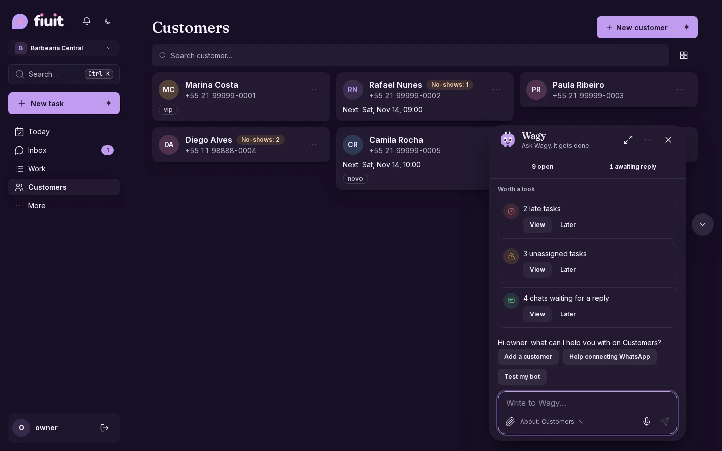
  • Quick quantities: type the quantity at once in the item editor.
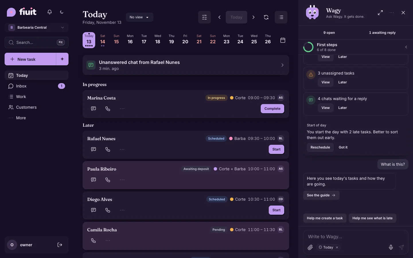
  • Numbers in order: total, amount due and the quote update on their own.
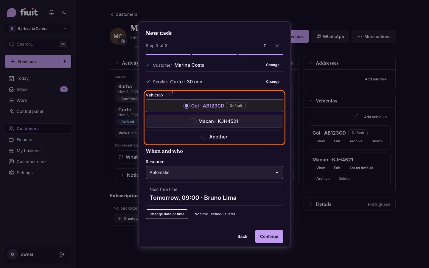
Permalink
Improvement

Finance moves up in the menu, right after Customers

The side menu changes order: Customers, Finance, My business, Customer care and Settings.

What changed

  • The menu now follows this order: Customers, Finance, My business, Customer care and Settings.
  • It is the same in the desktop panel and in «More» on mobile.
  • The screens inside each section do not change, and each role still sees only what applies to it.
Permalink
New

Items and quote, inside the stage you choose

In the flow editor you can add the “Items / quote” component to a stage: the task's items panel shows inside that stage.

Workshop task on the Diagnosis stage, with the items panel inside the stageWorkshop task on the Diagnosis stage, with the items panel inside the stage

Everything in its stage

  • Where it belongs: items and the quote show inside the stage that uses them, like a workshop's Diagnosis or Quote.
  • Only once: the panel isn't repeated loose on the task; if the flow adds it to several stages, it follows the task and appears in the most recent one.
  • No change to the money: it's the same panel as always, only where it shows changes.
Permalink
New

Every job with its delivery date

Your customers and your team know when each job is ready: the date is worked out from your business days and they hear about it if it changes.

Task header with the delivery date ready to pick a day and time

What you get

  • Dates that work themselves out: from your opening days and hours, skipping holidays and closed weekends.
  • Relaxed customers: they see when their job will be ready and hear about it if the date changes.
  • Nothing slips: anything past its date and still open is marked as late.
Permalink