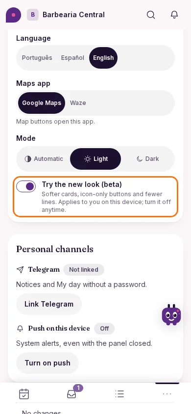
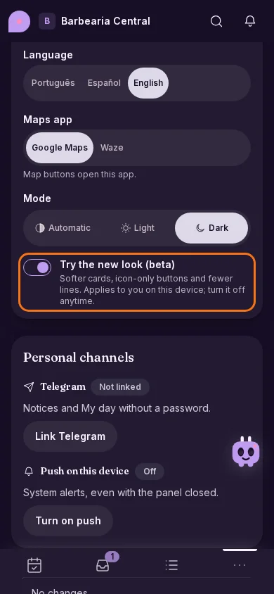
New
A new look for the panel, in beta
Try a softer, cleaner panel: rounded cards, icon-only buttons and fewer lines, without losing anything you already do.
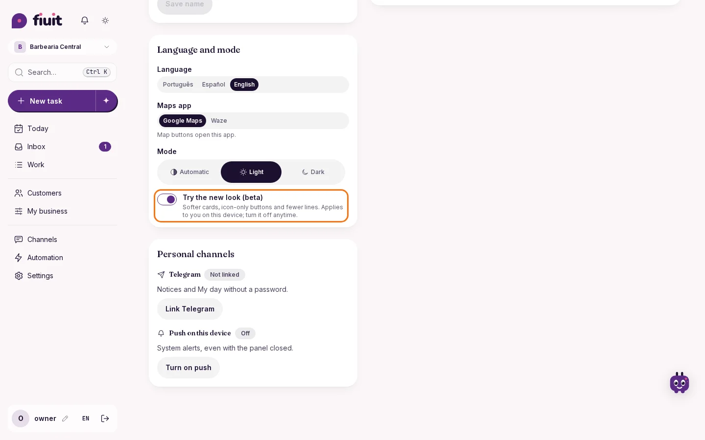
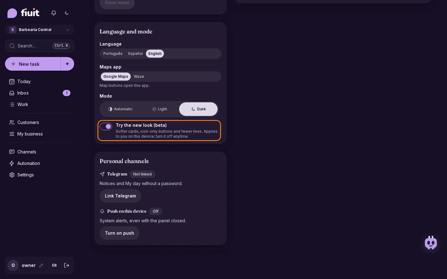
What you get
- Clearer at a glance: large rounded cards, with the status next to the name and one line less per task.
- Less noise: secondary actions are icons and the Focus entry takes no room.
- No risk: it's optional and turns off with one tap.